Tabs
When editing content via the back-end administration area of Mura, or using the "Full Edit" feature from the front-end public-facing view of your site, the various fields that are available for content items are grouped together within tabs. You can think of the Edit Content screen as simply one, giant form, because that's essentially all it is.
The "Basic Tab" is covered under the "Basic Content" section. In this section, we'll cover the other tabs available to you when editing content.

If you see a down arrow on the far right of the listing of tabs, simply click the arrow to view the additional tabs. This occurs when the browser is too narrow to display them all within the browser's viewport.

Note: If you don't see one of the tabs specified in this section, the group(s) you belong to may not have been granted access to those tabs.
Your site may also include tabs not identified in this section of the site. If so, your instance of Mura CMS is most likely using a custom plugin used specifically to create custom tabs and fields unique to your organization's needs.
Publishing
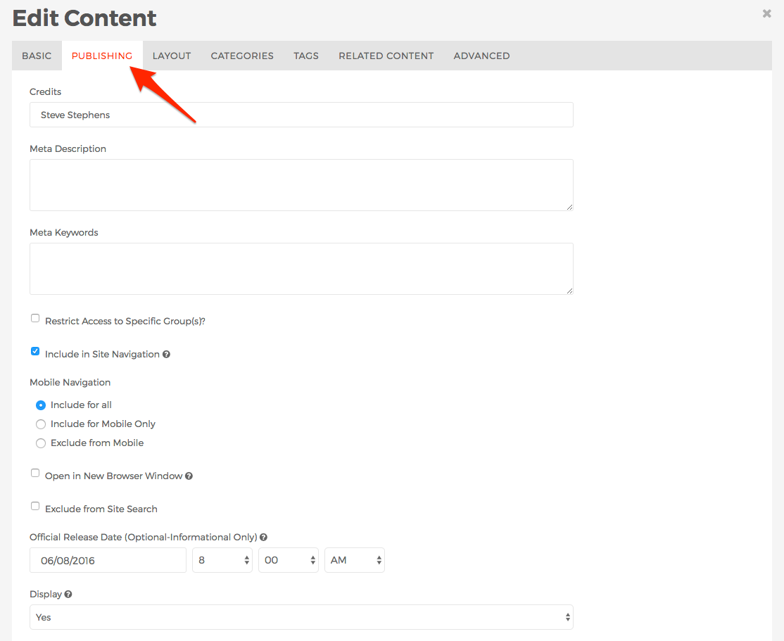
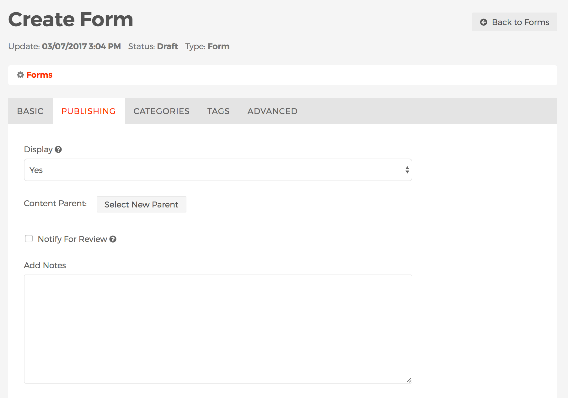
The Publishing tab is where you manage a content item's publishing-related fields such as Credits, Meta Description, Meta Keywords, Restrict Access to Specific Group(s), whether or not to Include in Site Navigation, whether or not to Display the content item, etc.

- Credits
- This field is much like a "byline" in a newspaper article, where you may enter the name(s) of the writer(s) of the the content. Information entered here may appear on the parent content item, if the parent is a Folder content type. This is especially useful when the content item itself is being used as a traditional "news" or "blog" item.
- Meta Description
- Meta Keywords
- Information entered here is used for the keywords attribute within the
<meta> tag for the specific content item. In the early days of web sites, this field was used by search engines in their web search ranking algorithms. However, information entered here is mostly ignored by search engines these days, as in 2009 Google officially announced they do not use the keywords in their web ranking.
- Restrict Access to Specific Group(s)?
- Include in Site Navigation
- If "checked" or enabled, anywhere Mura auto-generates navigational links, the specific content item should be listed, unless the item is not on display.
- If "un-checked" or disabled, Mura will not generate a link to the specific content item, however, if the content item is set to display and a user knows the URL of the content item, the content will display. This is useful when you wish to create content items such as landing pages from Google AdWords, or wish to have a Site Map, or other informational type page available to users, and don't wish to include a link in the primary navigation or sub-navigation.
- Mobile Navigation
- Mura CMS checks a browser's user agent string to determine whether or not the visitor is accessing the site from a mobile/handheld device. You may choose to show or hide links to content based on this information.
Note: Mura does not recognize tablets (e.g., iPad, Fire tablet, etc.) as mobile devices, since they typically have plenty of screen real estate to accommodate most traditional websites.
- Include for all (default)
- Links to the specific content item will be generated by Mura, regardless of which type of device the visitor is accessing the site from.
- Include for Mobile Only
- Links to the specific content item will only be generated by Mura if the visitor is accessing the site from a mobile/handheld device.
- Exclude from Mobile
- Links to the specific content item will not be generated by Mura if the visitor is accessing the site from a mobile/handheld device. In other words, links will only appear when accessing from a laptop/desktop computer or tablet.
- Open in New Browser Window
- If enabled, when a user clicks a Mura-generated link to the content item, it will open a new tab or browser window.
- Exclude from Site Search
- If enabled, the content item will not be included in search results when using Mura's search capabilities.
Note: This does
not control whether or not links to the content item will appear on search engines such as Google, Yahoo!, Bing, etc. If you wish to exclude the content item from commercial search engines, you could password protect the content by using the
Restrict Access to Specific Group(s) setting. For more information on controlling website crawlers and search engine indexing, visit
https://developers.google.com/webmasters/control-crawl-index/
- Official Release Date (Optional-Informational Only)
- The date and time you enter/select here is meta-data only. It is not used for scheduling purposes, and is informational only. If you wish to schedule content to appear on a specific date, use the Display field. Information entered here may appear on the parent content item, if the parent is a Folder content type. This is especially useful when the content item is being used as a traditional "news" or "blog" item.
- You may also sort content items by this field in specific sections of your site.
- Display
- This field controls whether or not the content item will be visible to users via the public, front-end view of your site.
- Yes
- If Yes, then the content item will be visible to users via the public, front-end view of your site.
- No
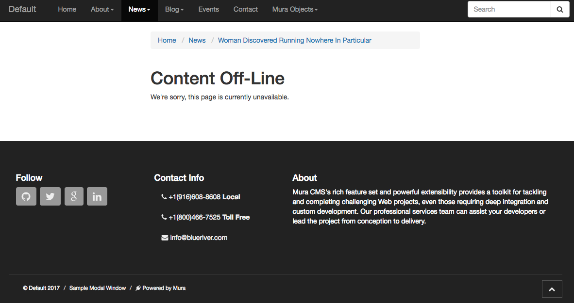
- If No, the content item will not be visible to users via the public, front-end view of your site, and links to the content item will not be generated, even when "Include in Navigation" is enabled. If a user lands on the specified content item when set to "no," they will see a screen with the default title of "Content Off-Line" and text of "We're sorry, this page is currently unavailable."

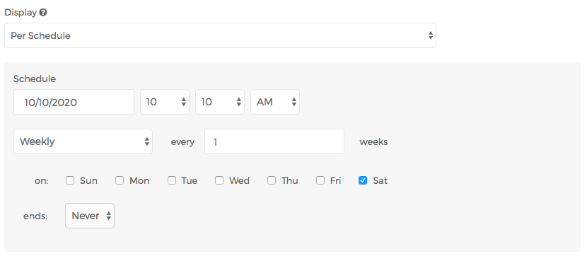
- Per Schedule

- You may specify a schedule for the content item to display, including the frequency of the display such as daily, weekly, monthly, etc. and when the content item should stop displaying, if ever.
- Content Parent
- You may use this field to move a content item to a new section of the site. See the Selecting New Parent section for more details and instructions.
- Content Expiration
- Entering a date/time in this field will simply flag the content item as "expired" and that it needs to be reviewed. It does not control whether or not the content item is on display. If you want a content item to stop displaying on or after a specific date/time, please use the Display field.
- Assign Content Expiration Notifications
- This field is useful when you wish to notify user(s) when a content item has expired according to the date/time entered under Content Expiration. If enabled, a Select users menu appears.
- Select users
- Select one or more users to be notified when a content item has expired, according to the date/time entered under Content Expiration. They will receive an email notification, and may also locate expired content via the List View tab of the Content view.
- Feature in this section?
- This field is a meta data field used to determine whether or not you wish the content item to be featured within the section is resides. This is useful when creating Collections, and you wish to highlight the specific content item. For example, a "Featured News" Collection might scan through all content items within the "News" section, and only pull out content items that have this field set to "Yes" or the date falls within the range specified under "Per Schedule."
- No (default)
- If selected, the content item will not be flagged as featured.
- Yes
- If selected, the content item will be flagged as featured.
- Per Schedule
- If the current date falls within the specified range, the content item will be flagged as featured. Otherwise, it will not be flagged as featured.
- Notify For Review
- When enabled, Send to and Message fields will appear.
- Send to
- You may select one or more users to receive an email notification after saving or publishing the content item. To select more than one person, use <CTRL> + click (on a PC) or <CMD> + click (on a Mac).
- Message
- Text entered here will accompany a link to view the content item in the email notification.
- Add Notes
- This field allows you to enter informational notes which can be shared amongst content managers, without it appearing anywhere on the public, front-end view of the site.
Layout
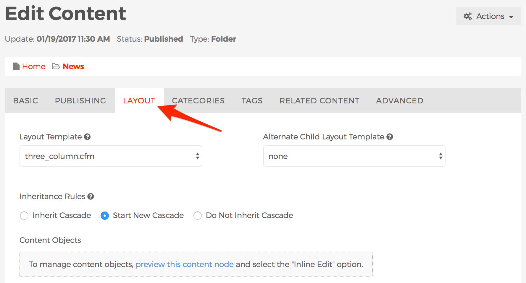
The Layout tab is where you can manage Layout Templates, and Inheritance Rules for display objects.

- Layout Template
- Controls which layout template to use for the content item you're currently editing.
- Alternate Child Layout Template
- Optionally select an alternate layout template to use by default for any children of this content item. If "none" is selected, child content items will use the selection from the "Layout Template" by default.
- Inheritance Rules
- Inherit Cascade
- This default option allows the content to inherit any display objects assigned to parent content items.
- Start Cascade
- ???????This option will prevent any display objects that have been assigned to parent content items from appearing, and begin a new cascade of display objects. This option is most commonly used when creating a top level section of the site such as News, or Blog sections, etc.
- Do Not Inherit Cascade
- This option will prevent any display objects assigned to the parent from displaying, yet allow those display objects to pass through to its children.
- Content Objects
- Since display objects are managed via the front-end public-facing view of the site, a link is provided to take you to that view in order to manage any content display objects.
Categories
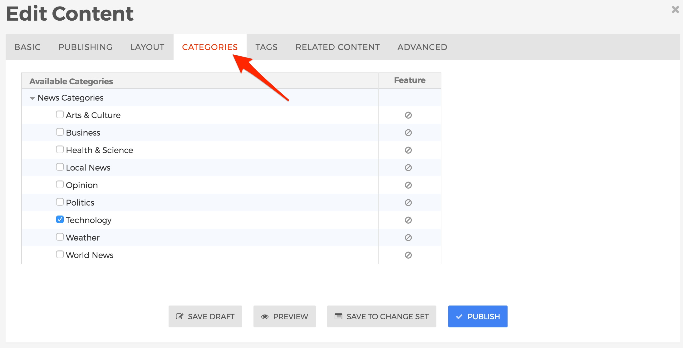
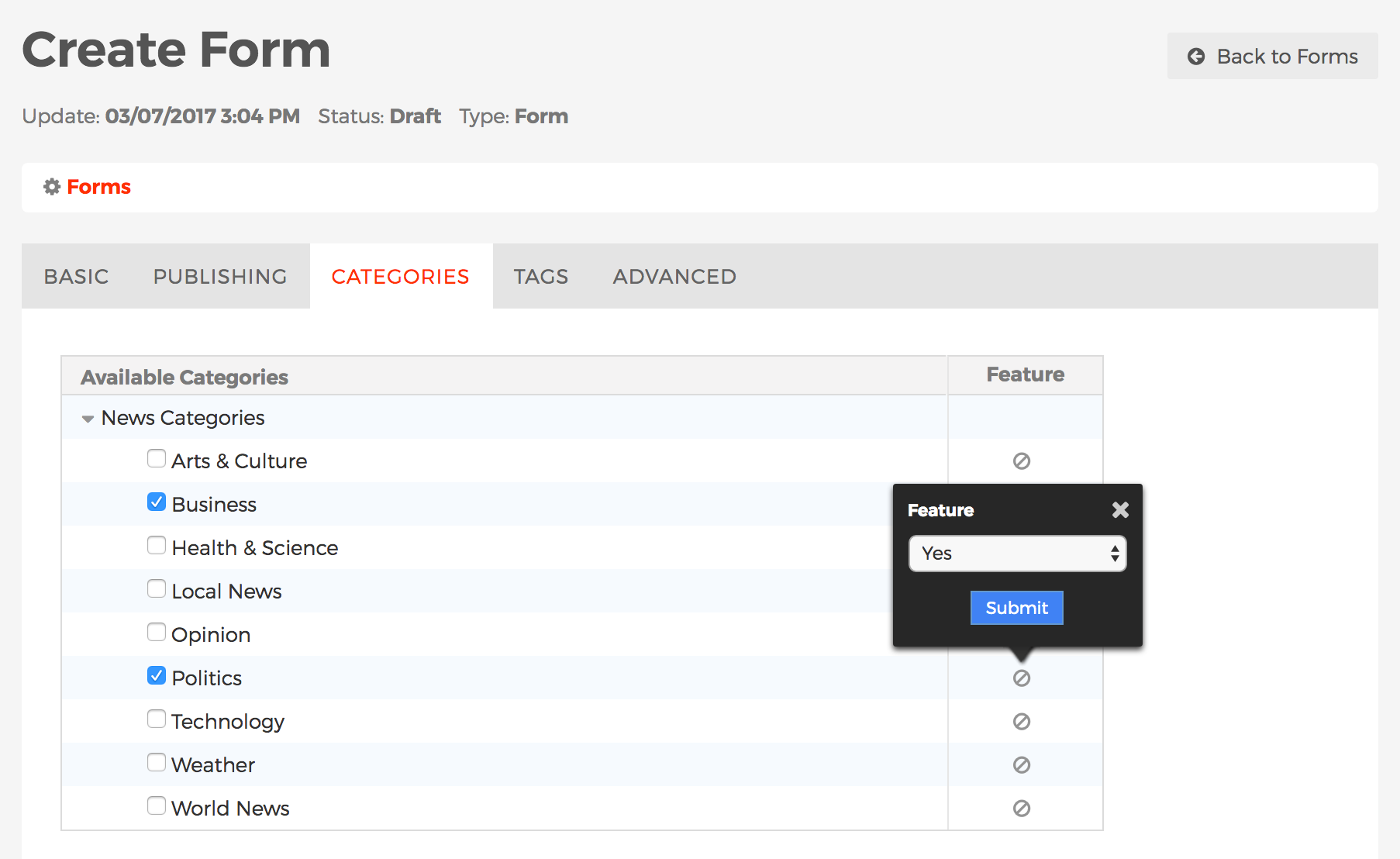
The Categories tab is where you manage a content item's Categories. To learn more about Categories, including how to create/manage categories, and categorize content, visit the Categories section.

Tags
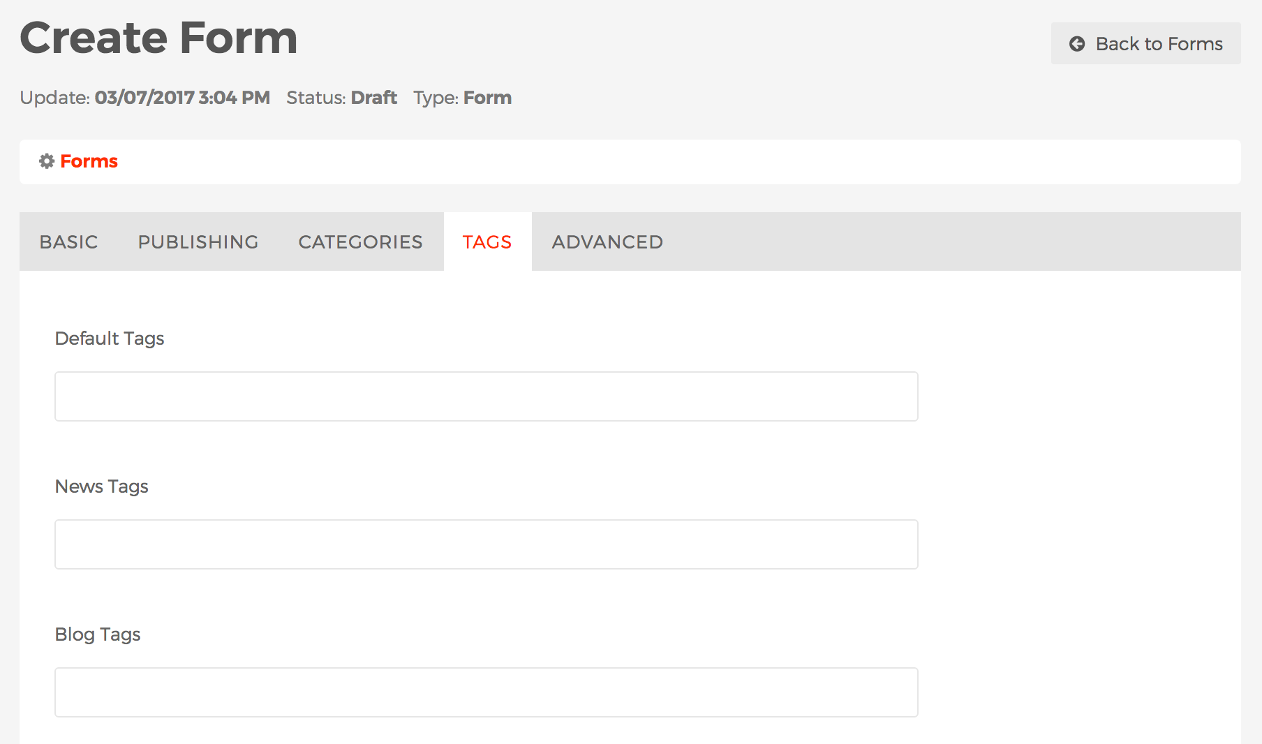
The Tags tab is where you manage a content item's Tags. Visit the Tags section to learn more about Mura Tags.

Related Content
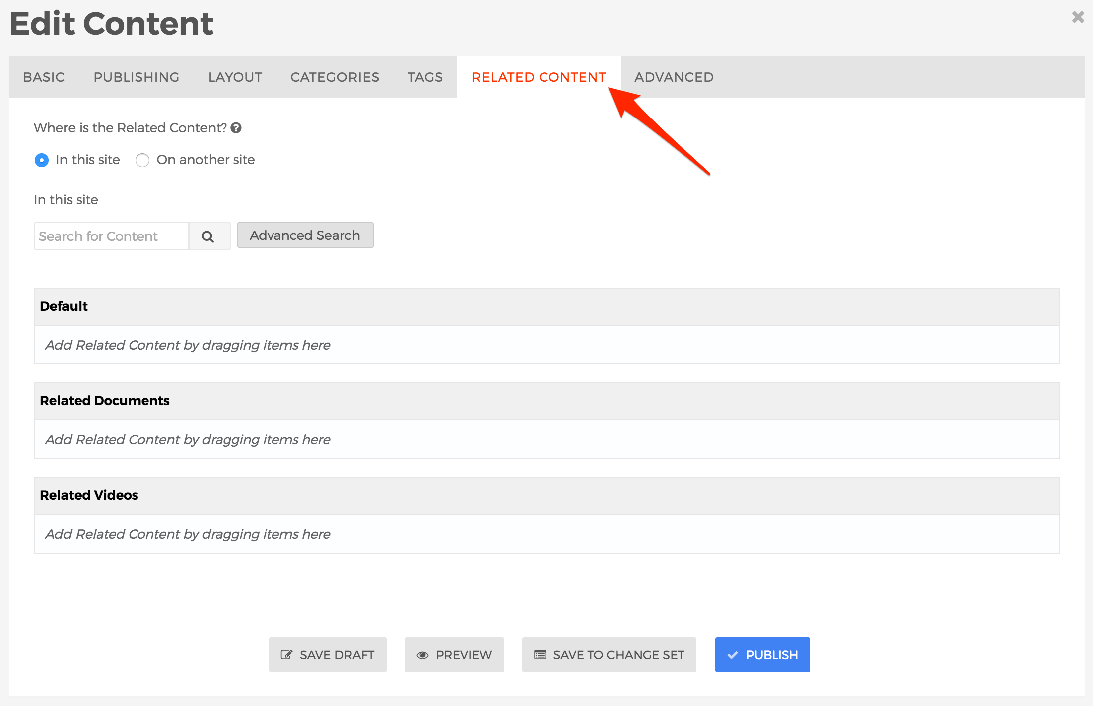
The Related Content tab is where you manage a content item's Related Content. The content can exist either on the same site as the content item itself, or on a completely different website altogether.
The information collected here is used when outputting the "Collection" display object, if the content source is set to "Related Content." See the Collection section for information on how to output the a listing of Related Content.

- Where is the Related Content?
- You may select content from either "In this site" or enter a link to content located "On another site."
- In this site
- Enter text into the search field, then click the spyglass to obtain a listing of search results.

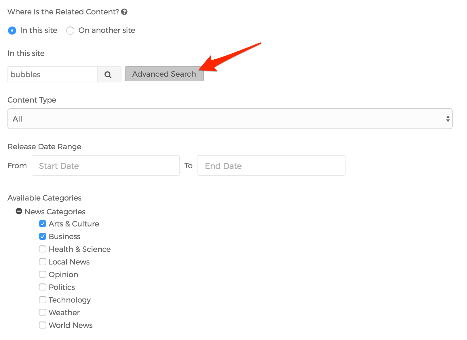
- Optionally, select the "Advanced" button to filter your search results to specific Content Types, Official Release Date Ranges, and Categories.

- On another site

- Title
- Text entered in the "Title" field will appear wherever a link is generated or displayed by Mura CMS.
- URL
- The "URL" entered here will be the link used to direct a user if/when they click the "Title" entered above.
- Click the plus sign located next to the URL to generate a list of "Available URLs"

- How to assign an item to Related Content Set
- Once you've either located content you wish to use as "Related Content" via "In this site" or "On another site," you can either click, drag, and drop the item to your desired Related Content Set, or click the plus sign located to the left of the item, and then click the checkbox next to your desired Related Content Set to assign it as related content.

- How to sort items in a Related Content Set
- You can also control the sort order of the related content items by dragging and dropping the items into your desired order.

- How to remove an item from a Related Content Set
- To remove an assignment, locate the item you wish to delete under the Related Content Set, and click the circle with the "x" at the far right of the item's row.

- Select your desired publishing option to save your changes.
Note: Relationships created using this method are one-way by default. This means that if "Content Item A" is related to "Content Item B," then "Content Item B" is not necessarily related to "Content Item A." If you want to make the relationship both ways, you'll need to edit the other content item, and repeat the process to complete the two-way relationship.
Extended Attributes
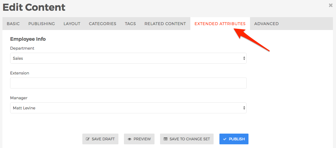
The Extended Attributes tab will appear if your site is using Class Extensions, and you're editing content with custom attributes/fields that have been explicitly assigned to this tab. Please consult your organization's documentation for details about any custom fields located here.

Advanced
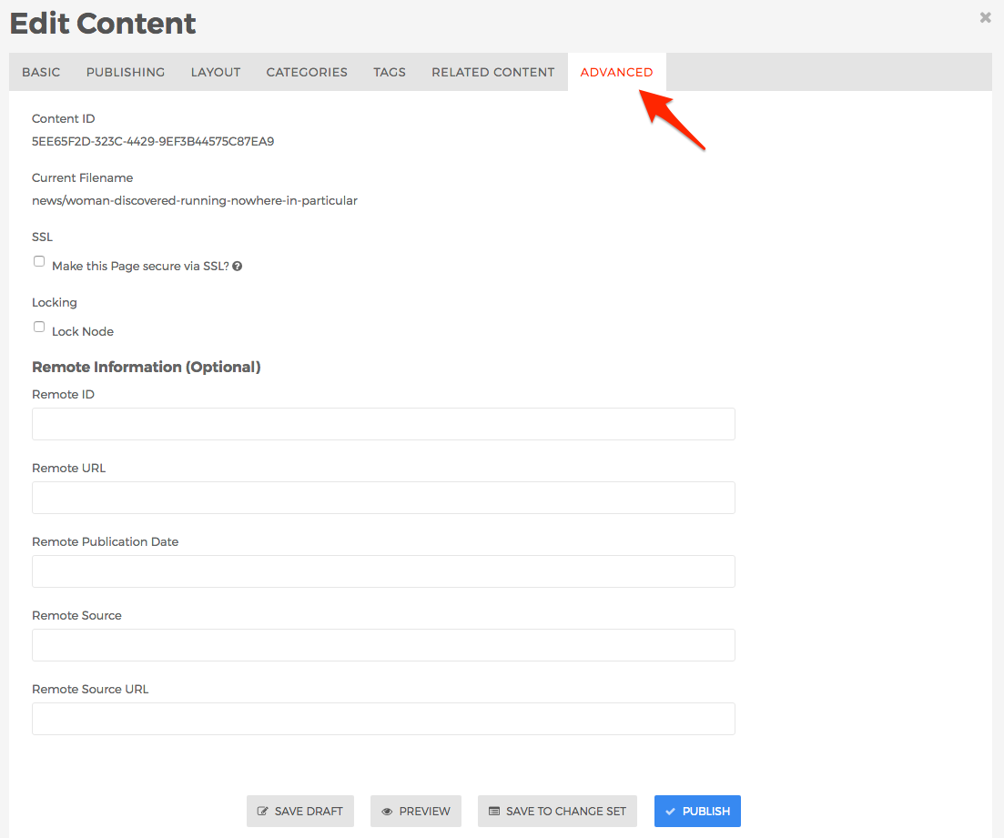
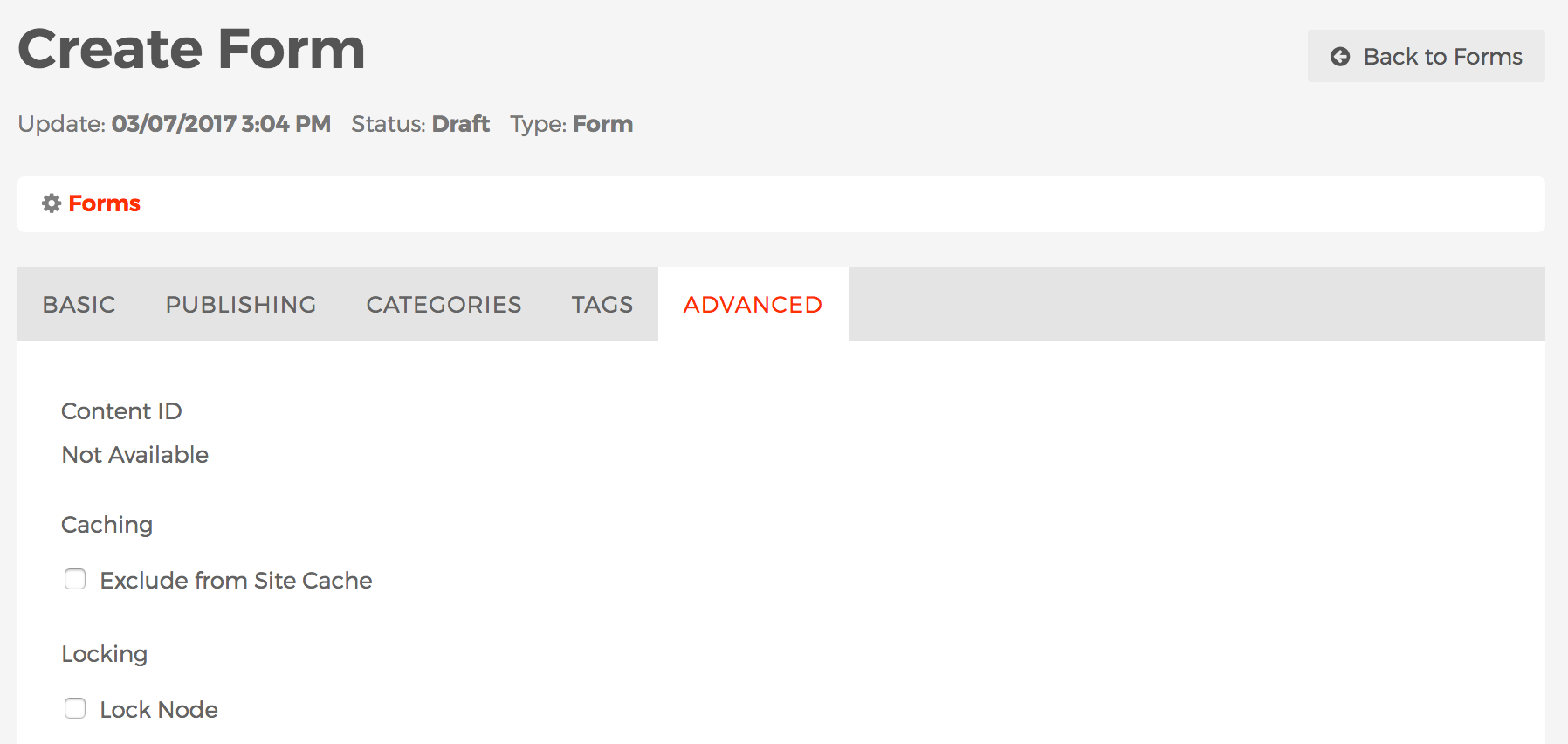
The Advanced tab contains some information about the content item, and includes a few optional fields as described below.

- Content ID
- This is a unique identifier for the content item.
- Current Filename
- This is the unique filename for the content item. The information located here is used by Mura as the unique URL path to the content item, and will be displayed in the URL when viewing the content from the front-end view of your site.
- SSL
- Locking
- Mura offers the ability to "lock" content items so they will not be accidentally deleted by content managers.
- Lock Node
- If enabled, content managers will not be able to delete the content item.
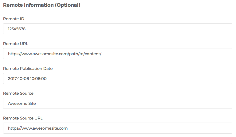
- Remote Information (Optional)
- These fields are primarily used by developers and can usually be ignored by most content managers. Developers often use these fields when importing or associating the specific content item to content which exists on an external website, database, or network system.

- Remote ID
- This field typically stores the unique ID of content from an external website, database, or network system. However, this field does not have to be unique in Mura.
- Remote URL
- This field typically stores the unique URL of content from an external website or network system.
- Remote Publication Date
- This field typically stores the publication date of content imported or associated to content from an external website, database, or network system.
- Remote Source
- This field typically stores the name of the remote source for content.
- Remote Source URL
- This field typically stores the primary domain of the remote source for content.
Publishing Options
Content managers have a number of publishing options with Mura CMS. You can learn about some of the basic publishing options by visiting the Basic Publishing section. In this section, you can learn about version histories, comparing different versions of content, inspecting audit trails, and how to import and export content.
Version History
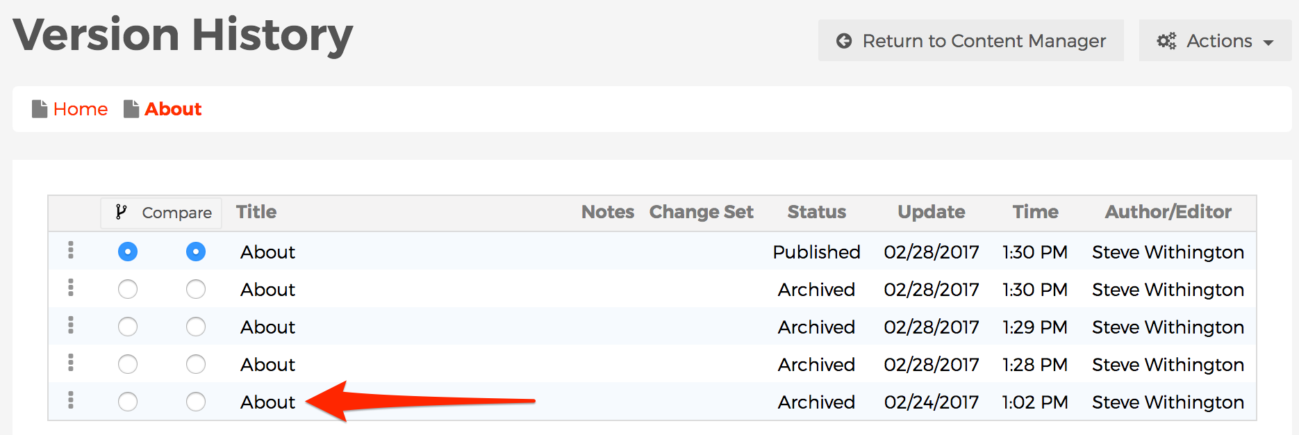
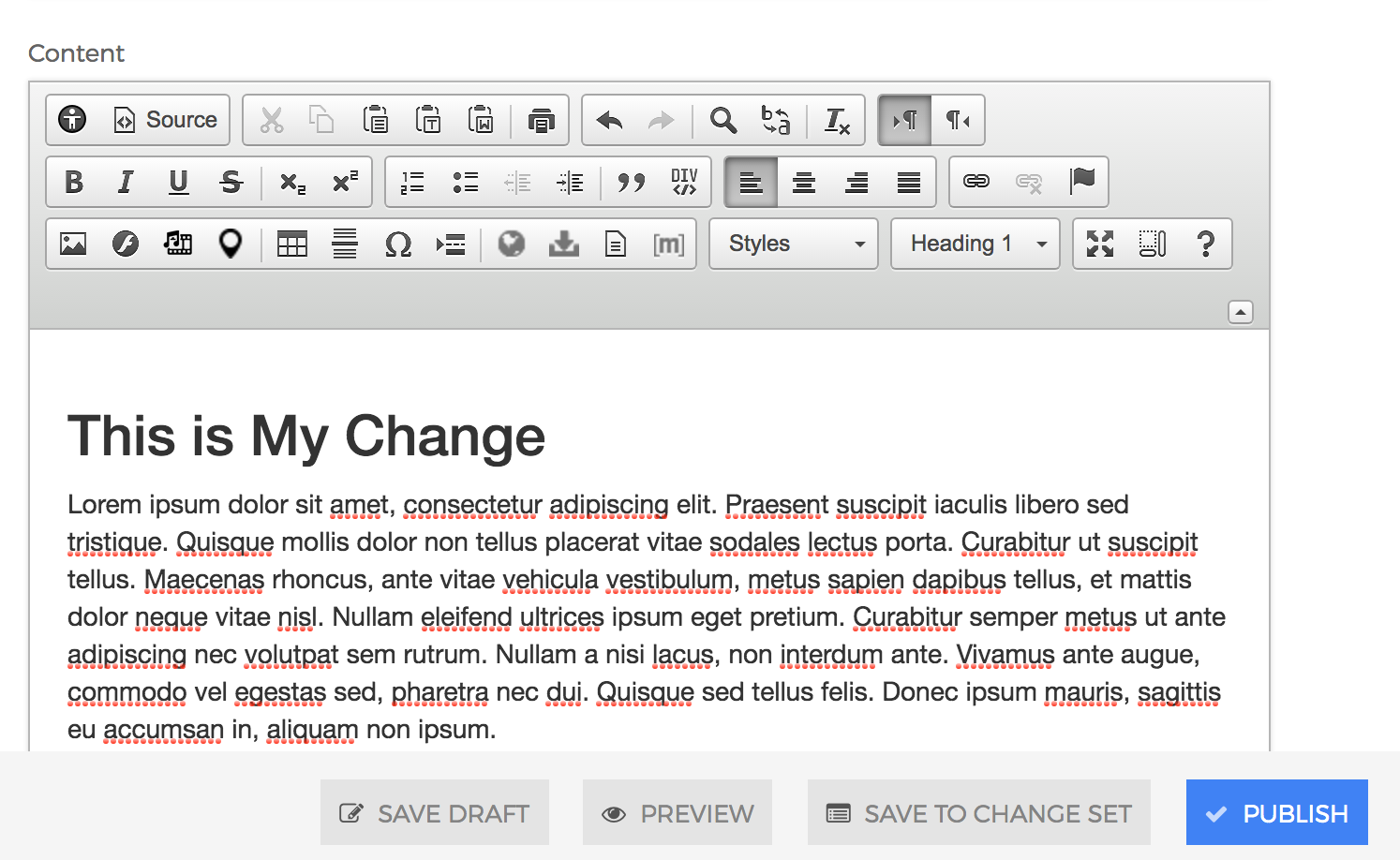
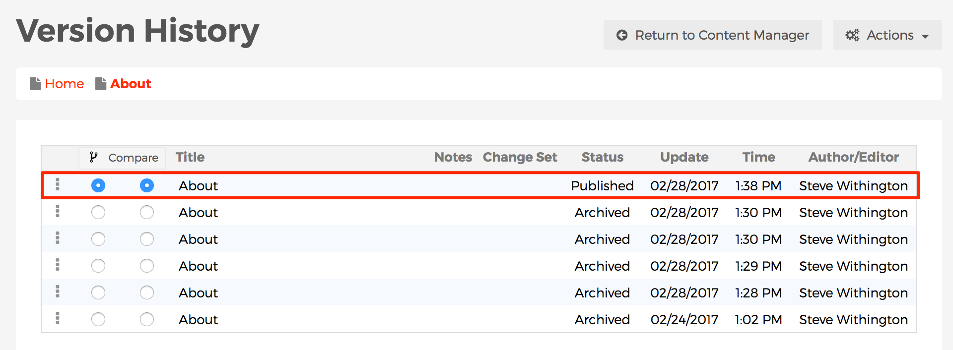
Each time a content item is saved, a new version of that content is created. If the content item was published, the previously published version is archived. Each version of the content is available for preview, editing, and publishing through the Version History menu.
To access Version History for content, you can follow these steps:
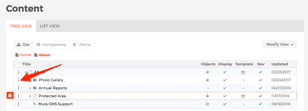
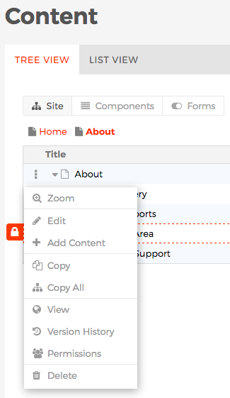
- From the Tree View or List View tabs, click on the three-dotted menu located next to the content item you wish to view.

- This should reveal a menu of options to select from.

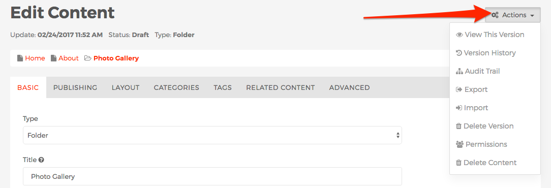
- Or, from the "Edit Content" screen, click the Actions button to reveal a menu of options.

- Select the Version History option from the menu of options.
- Or, from the front-end editing view, select the Version History icon button from the front-end toolbar.

- The Version History screen should appear.

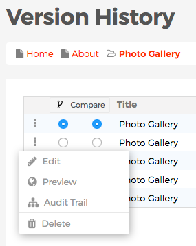
- From the Version History screen, select the three-dot menu next to a specific version of content to Edit, Preview, Delete, or view the Audit Trail.

- From the Version History screen, you can also click the Actions button to reveal options to Clear Version History, Delete the content item altogether, and edit the Permissions of the content item.

Compare Versions
With Mura CMS, you can compare different versions of a content item, to visually see what has changed to various fields. You can compare versions of content from either the Version History screen, or the Audit Trail screen. Follow the steps below to compare different versions of a content item.
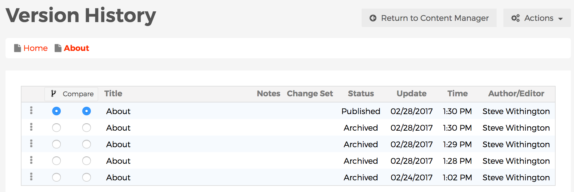
- On both the Version History and Audit Trail screens, there are two columns of radio buttons located under a Compare button.

- Select a radio button in one column to indicate the version you want to compare to, and another radio button in the other column to indicate the version you wish to compare from. It really doesn't matter which column you select for either one, as long as the radio buttons in each column are selecting different content versions, Mura will be able to display the differences between the two selected versions.
- Next, click the Compare button above the two columns of radio buttons.

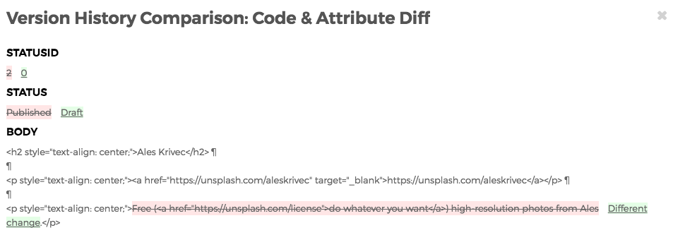
- The Version History Comparison: Code & Attribute Diff screen should now appear, revealing which fields have been changed. The newer version of content will be highlighted in light-green and underlined, while old information will be highlighted in pink with a strikethrough.

Audit Trail
An Audit Trail reveals the individual history of each specific version of content. While similar in nature to the Version History, the primary difference is that content managers can determine which version was used as its source. To view an Audit Trail, go to the Version History of your desired content item, and follow the steps below.
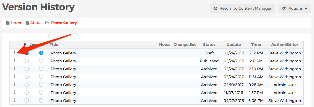
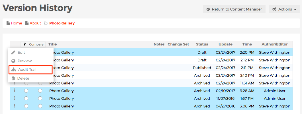
- From the Version History screen, select the three-dot menu icon next to the content version you wish to investigate.

- A menu of options should appear, including an option labelled Audit Trail.
- If you hover (don't click!) over the Audit Trail label, the specific version of content you're hovering over will be highlighted, as well as the versions that it derived from. In the example below, hovering over Audit Trail of the most recent draft reveals the version from 02/10/2017 was used as its source, and the version before that was used at its source, and so on.

- If you click on the Audit Trail menu option, you should be taken to the Audit Trail screen, revealing the specific history of that particular version of content you're currently working with, thus eliminating any unrelated versions from view.

Export Content
Mura CMS offers the capability to export content from your website. You can choose to export your entire site, a section of your site, or even just a page. This is useful for creating a simple backup of a small section of your site, or if you want to move/copy a section of your website to a completely different Mura CMS website.
How to Export Content
- Log in to the back-end administration area of the website.
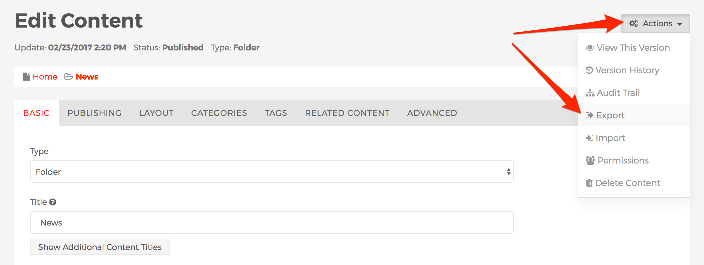
- Select the content item representing either the page or section you wish to export, and edit the content item.
- From the Edit Content screen, click the Actions button, and select Export.

- If the content item you've selected has any children (sub-pages, files, etc.), you should be presented with the Export Content screen. If you're exporting a single content item without children, this screen will not appear.

- You may choose to export either the Children Only, or This Content Item and Children. When making your selection, you may wish to consider how you will be using the content you are exporting. For example, if you want to include the "News" landing page in addition to its children, then select "This Content Item and Children."
- Once you've made your selection, click Export Content.
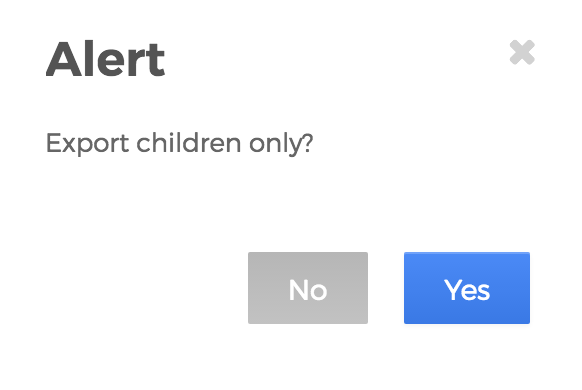
- From the Alert dialog window, click Yes to confirm your selection.

- Once Mura CMS bundles the content together for you, a prompt to save the export file as a .ZIP document will appear. You can choose to save it wherever you wish.
- The exported file is now ready for archival and/or ready to be imported into another Mura CMS site.
Import Content
Mura CMS offers the ability to import content that has been exported from Mura CMS, quickly and easily. Please review the steps from the Export Content section before proceeding.
How to Import Content
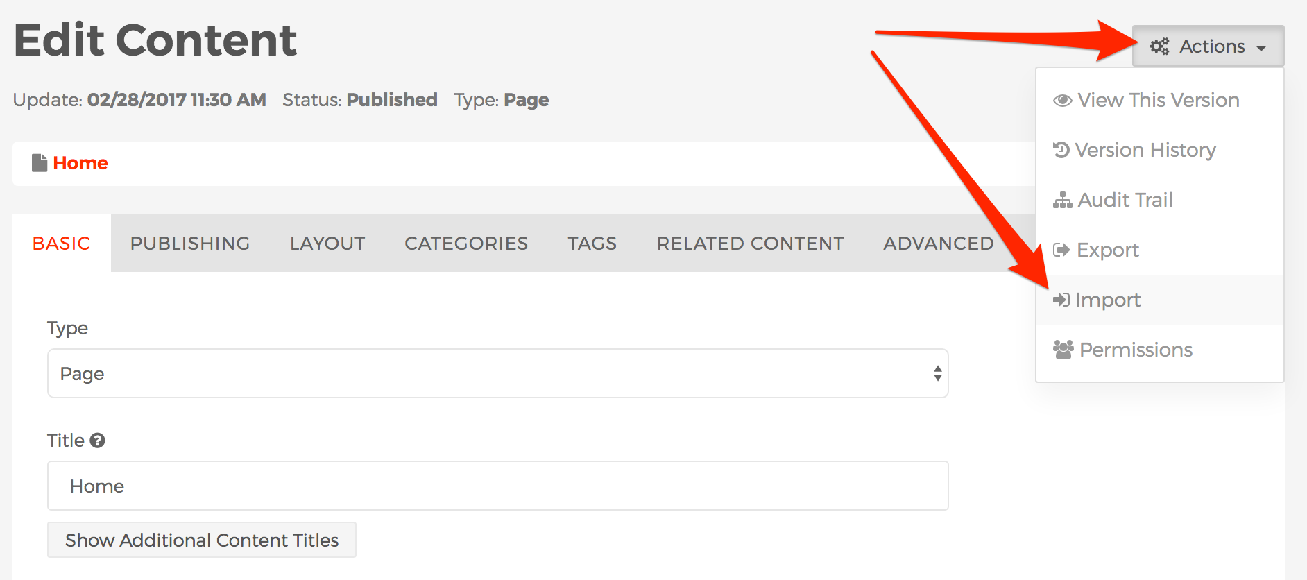
- From the back-end administration area of Mura, select a content item to edit, where you would like to import the new content. For example, if you would like to import the entire "News" section, you could choose to edit the "Home" page.
- From the Edit Content screen, go to Actions > Import.

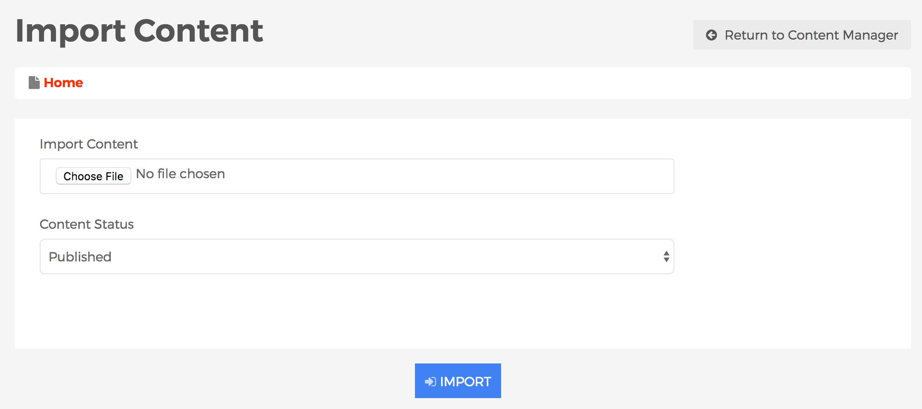
- You should be taken to the Import Content screen.

- Click Choose File or Browse to select the Mura CMS created/exported .ZIP file you wish to import.
- Select your desired Content Status for the imported content.
- Published
- The content will be visible by users visiting the front-end, public facing view of your website.
- Draft
- The content will not display on the front-end, public facing view of your website.
- Save to Change Set
- When you select Save to Change Set, the Change Set Name field will appear. Simply enter your desired Change Set Name.

- Click Import.
- Once completed, the imported content should now appear.
Components
Components are reusable content objects that can be shared across multiple pages or sections within your site. For example, maybe you have an announcement you want to share across your website such as "Closed for Holidays." Without components, you would most likely have to contact a developer, then give the developer a listing of areas you want the notice to appear. However, in this scenario, you most likely would not be able to edit the content of the notice or control whether or not it is on display, etc.
Utilizing components shifts that control back to the content manager. You could create a notice, and choose which page(s) and/or section(s) of the site you would like it to appear, all using a single interface. This means that although the content may span several pages or sections of the site, you can simply edit the component once and it will update all instances throughout the entire site.
Another function of components is to use them as content templates so that non-technical users can recreate a visual style for a specific type of content without having to start from scratch.
How to Create a Component
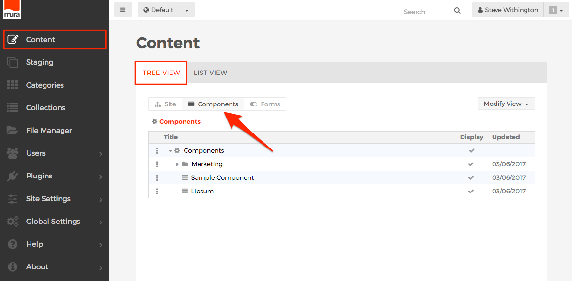
- From the back-end administration area, go to the Content section, select the Tree View tab, then select the Components button.

-
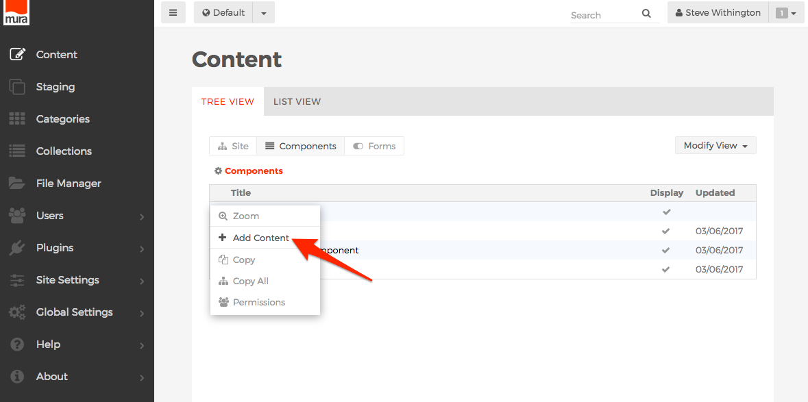
Click the three-dotted menu beside Components and select Add Content.

-
The Select Content Type dialog window should appear.

-
Component
-
Folder
-
The Folder option is available so that you can create groupings of Components. This is useful for grouping components logically and also for keeping components used by similar groups of users together so you only need to set permissions on the Folder, versus having to modify permissions for each and every component.
-
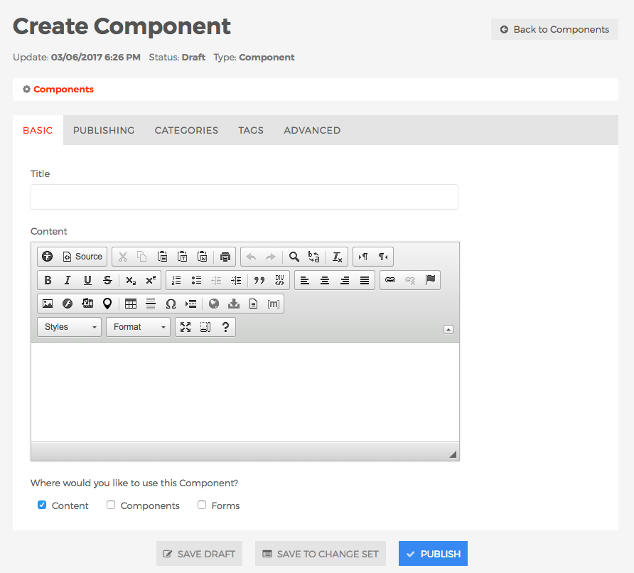
The Create Component screen should appear.

-
Basic Tab
-
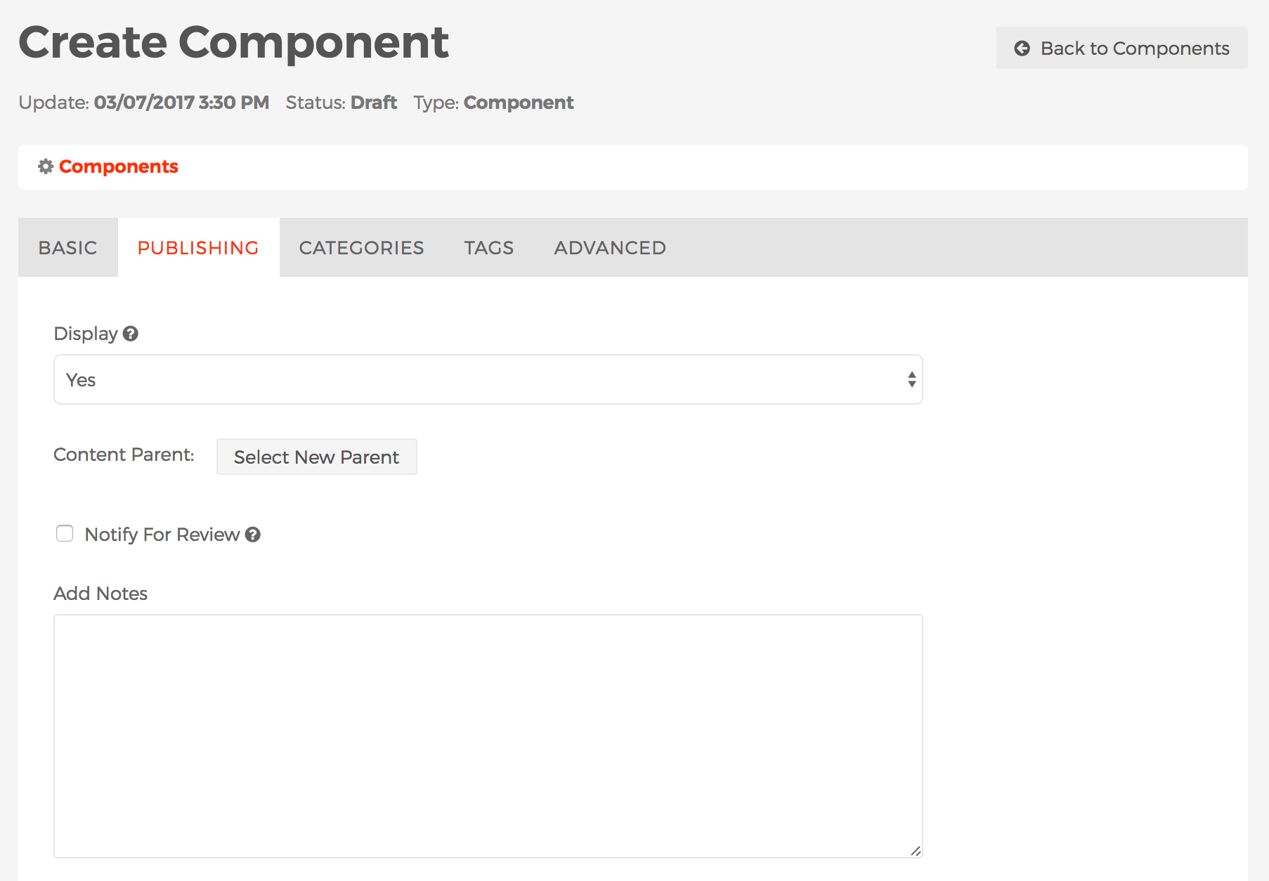
Publishing Tab

-
Display
-
Content Parent
-
Notify For Review
- When enabled, Send to and Message fields will appear.
- Send to
- You may select one or more users to receive an email notification after saving or publishing the component. To select more than one person, use <CTRL> + click (on a PC) or <CMD> + click (on a Mac).
- Message
- Text entered here will accompany a link to view the component in the email notification.
-
Add Notes
-
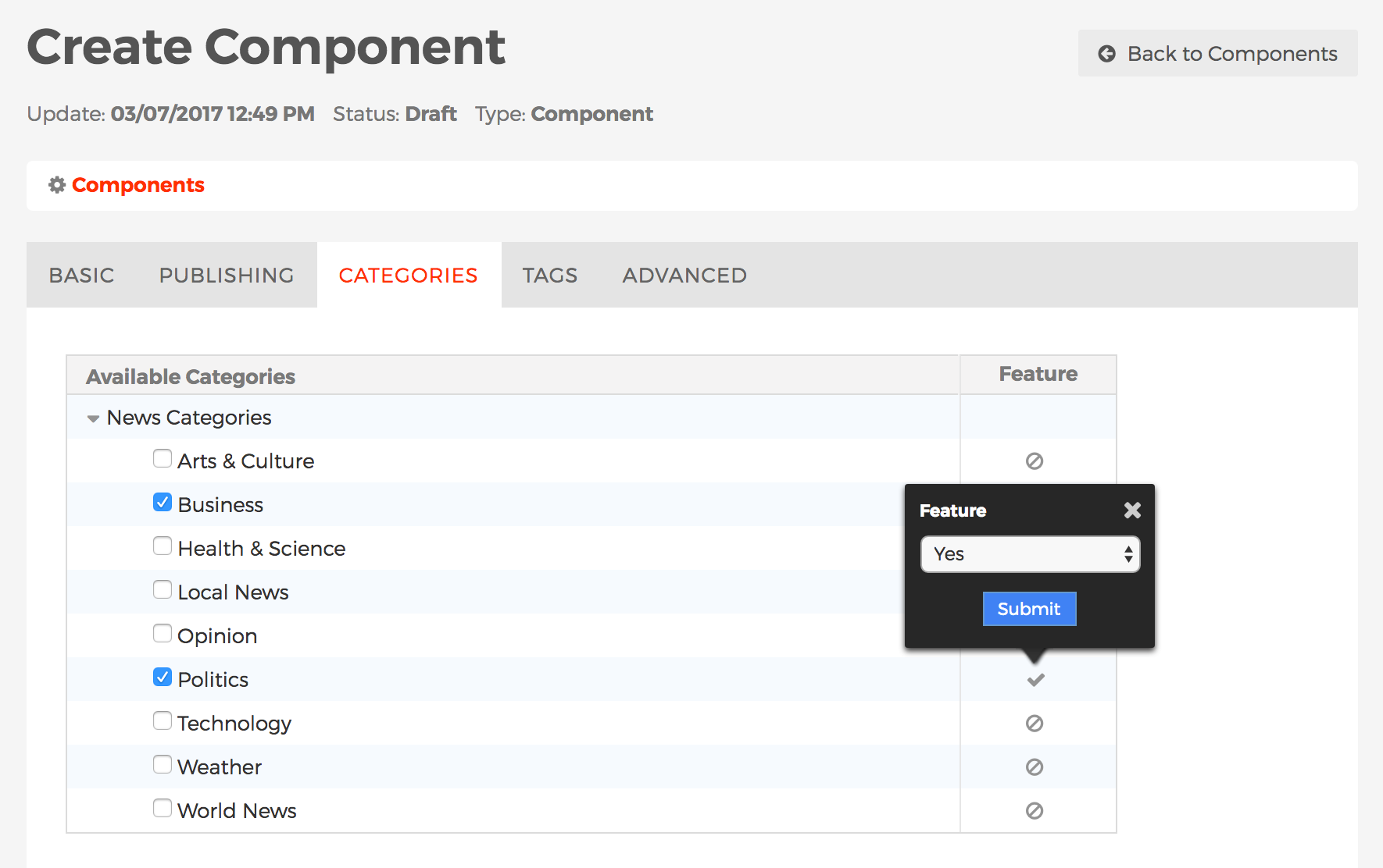
Categories Tab

-
The Categories tab is where you manage a component's Categories. To learn more about Categories, including how to create/manage categories, and categorize content, visit the Categories section.
-
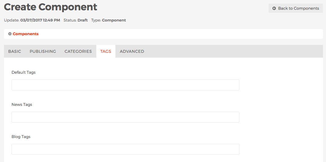
Tags Tab

-
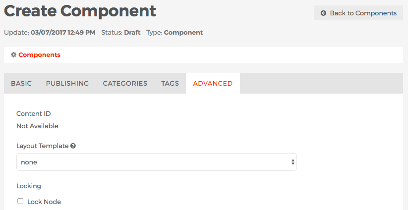
Advanced Tab

- Content ID
- This is a unique identifier of the component and typically used by developers.
-
Layout Template
-
Locking
- After completing the form, select your desired publishing option to save your component.
- To add the component to a page or section of your site, please visit the Component Display Object Type section.
Collections
Collections are essentially indexes of Mura CMS content items based on pre-defined search criteria and/or filters.
For example, Mura CMS can create an index of content items which have been flagged as "Featured" and categorized as "Domestic News" where the content resides under either the Blog or News sections of your site. You can control the maximum number of items you wish to display and more.
You can also choose to broadcast Collections as RSS feeds (http://en.wikipedia.org/wiki/RSS), making it easy for visitors, or even other web sites, to consume information from your site and bring visitors back for details.
In addition to creating Collections of Mura content items, Mura CMS can also consume external RSS feeds and display pieces of that information on your site using the Collection display object, and "Remote Feed" as the Content Source.
Local Indexes
A Local Index is essentially a collection of content which has been indexed and aggregated from either the entire site, or specified areas of the site, based on desired filter criteria. Once created, these Local Indexes can be used as Collection display objects in one or more areas of the site.
These built-in, customizable Collection display objects are generally a listing of content items which typically include the title, associated image, summary text, official release date, author, and a hyperlink to the full version of the page.
Mura CMS also gives you the ability to publish a Local Index as a RSS feed (http://en.wikipedia.org/wiki/RSS) to syndicate content automatically.
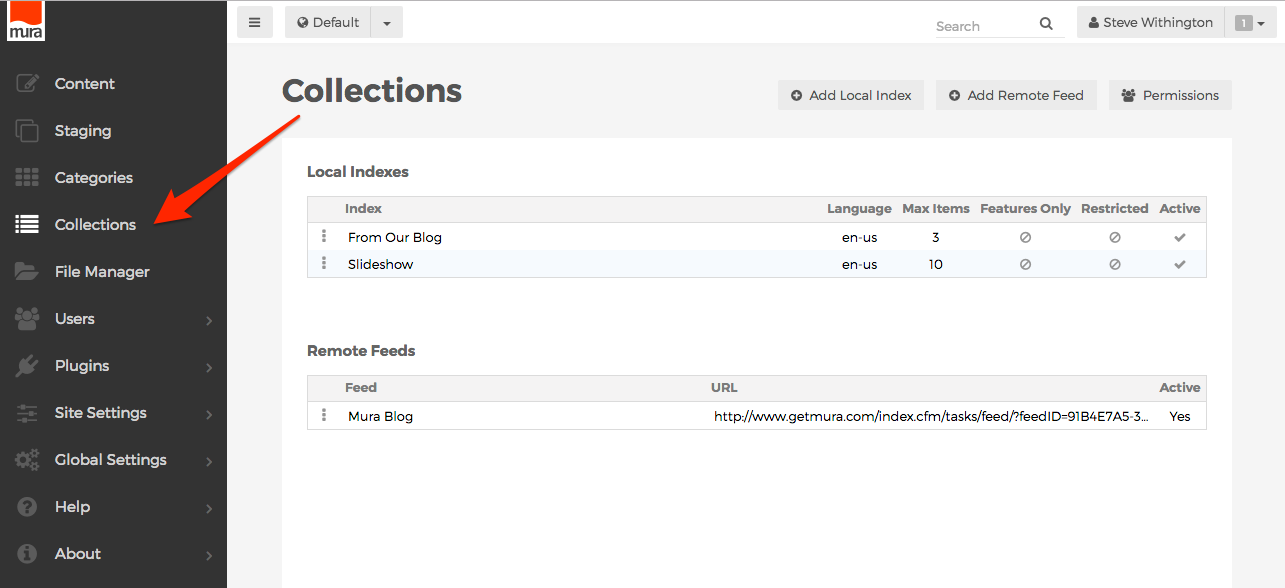
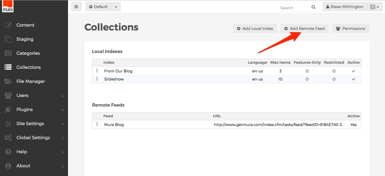
Collections are managed via the back-end administration area of Mura CMS. From the admin navigation menu, select Collections to view the Collections screen.

How to Create a Local Index
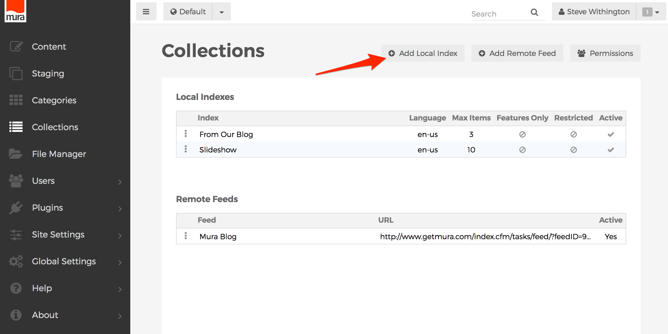
- From the Collections screen, click the Add Local Index button.

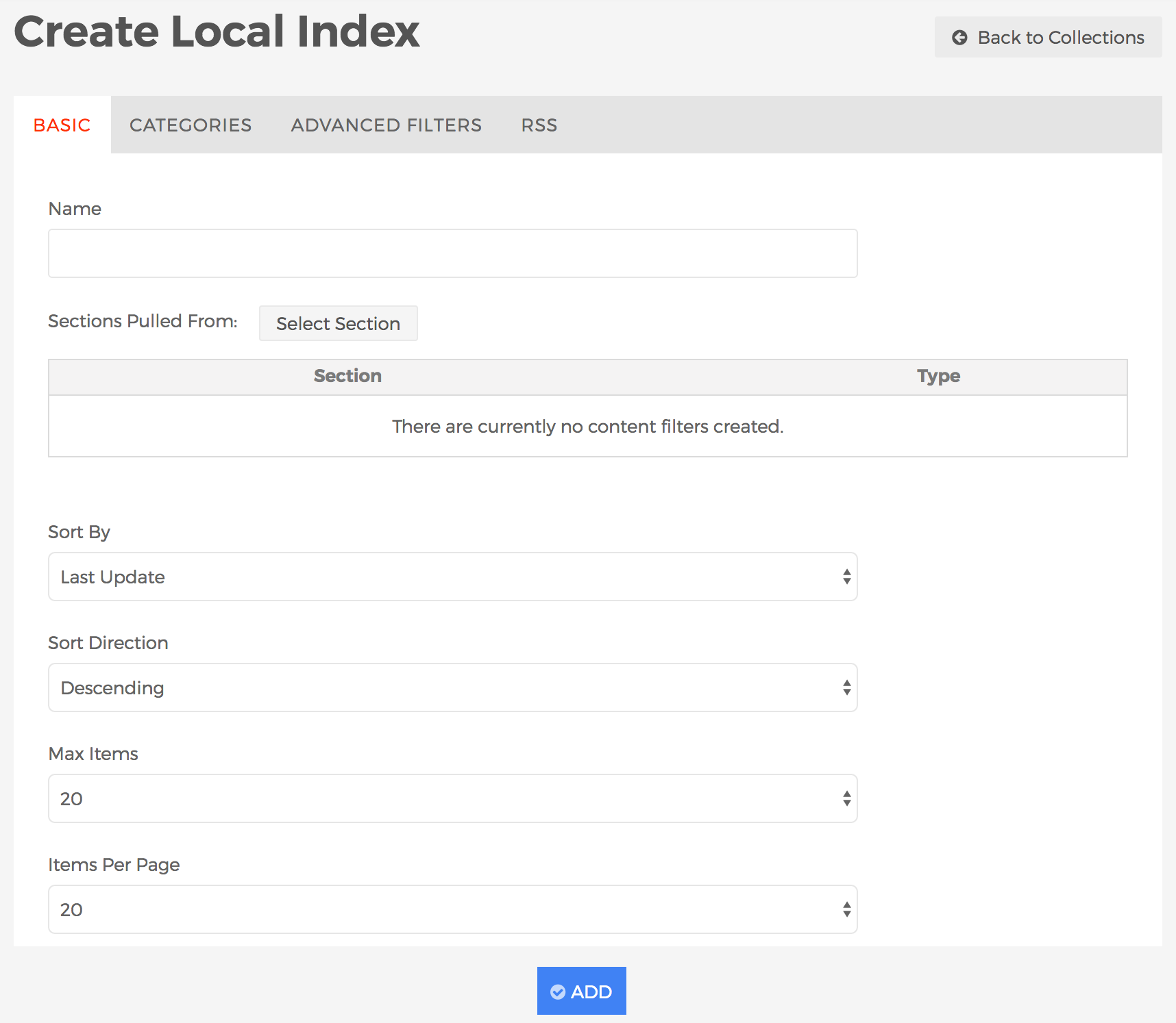
- The Create Local Index screen should appear. Take a look at the default settings. These are the default "filters" that control which content items get indexed.

- Basic Tab
- Name (required)
- Enter a name for the Collection.
- Sections Pulled From
- You may optionally select zero, one, or more section(s) to narrow down where you want content items to be searched for. If you leave this blank, Mura CMS will automatically search the entire site. Follow the steps below to apply one or more section(s) to the Local Index:
- Click the "Select Section" button to review a search box.
- Enter your desired section title (e.g., "News"), then click the spyglass button.
- Results will be displayed below the search box. Click the plus sign next to the section you would like to include in the Local Index. Once you click the plus sign icon, the selected section should then appear under the Section area.

- If you select the wrong section, click the trash can icon to remove it.
- Repeat these steps for each section you would like to include in the Local Index.
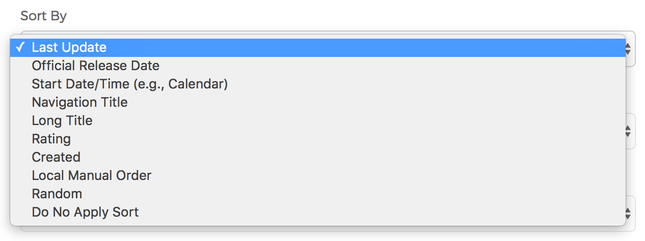
- Sort By
You can sort your Local Index by a variety of fields, or explicitly "Do Not Apply Sort".

- Last Update
- Official Release Date
- Start Date/Time (e.g., Calendar)
- Navigation Title
- Long Title
- Rating
- Created
- Local Manual Order
- Random
- Do Not Apply Sort
- Sort Direction
- Once you choose your Sort By option, you can choose to sort the Local Index by Ascending or Descending.
- Max Items
- Limit the number of content items returned by making a selection here.
- Items Per Page
- Limit the number of content items to be displayed on the page at a time. If more content items are returned than the number selected here, pagination will display.
- Include features only?
- If Yes, Mura will only include content items where the "Feature in this section" field has been enabled.
- If No (default), Mura will ignore this field.
- Include navigation items only?
- If Yes, Mura will only include content items where the "Include in Site Navigation" field has been enabled.
- If No (default), Mura will ignore this field.
- Include items that have been excluded from site search?
- If Yes, Mura will include items that have "Exclude from Site Search" enabled on the Publishing tab.
- If No (default), Mura will not include items that have "Exclude from Site Search" enabled on the Publishing tab.
- Lock name?
- If Yes, Mura will prevent the "Name" of the Collection from being changed, rendering the field as a read-only field. This is useful for developers who reference the specific Collection via code.
- If No (default), the "Name" of the Collection is editable.
- Categories Tab

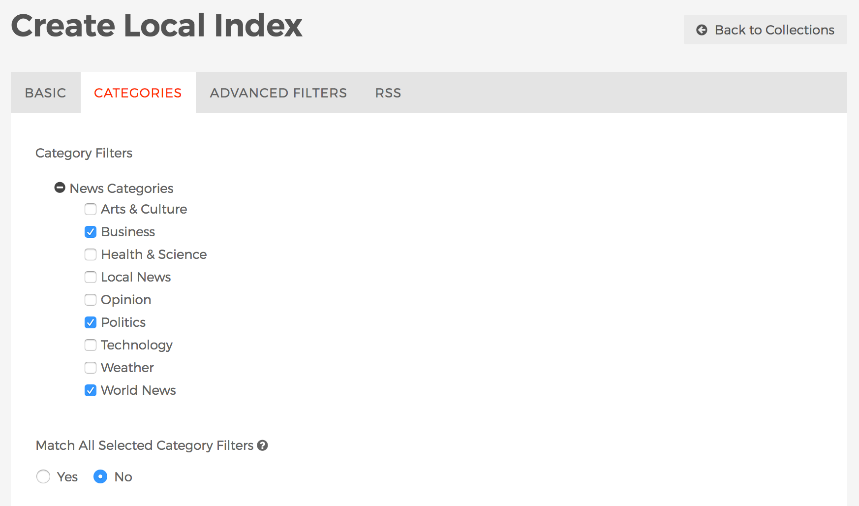
- Category Filters
- Select any desired categories you wish content items to match in order to be included in the Collection.
- Match All Selected Category Filters
- If Yes, then content items must be categorized as all selected/applied Category Filters to be included in the Collection.
- If No, then content items can be categorized as any of the selected/applied Category Filters to be included in the Collection.
- Advanced Filters Tab

- Choose Advanced Filters
- This section allows you to apply filters based on various form fields, including custom attributes created using Class Extensions. You can then filter based on a number of options pertaining to that field and criteria. For example, whether or not a field such as Credits "Contains" a particular value, as shown in the example above.
- RSS Tab
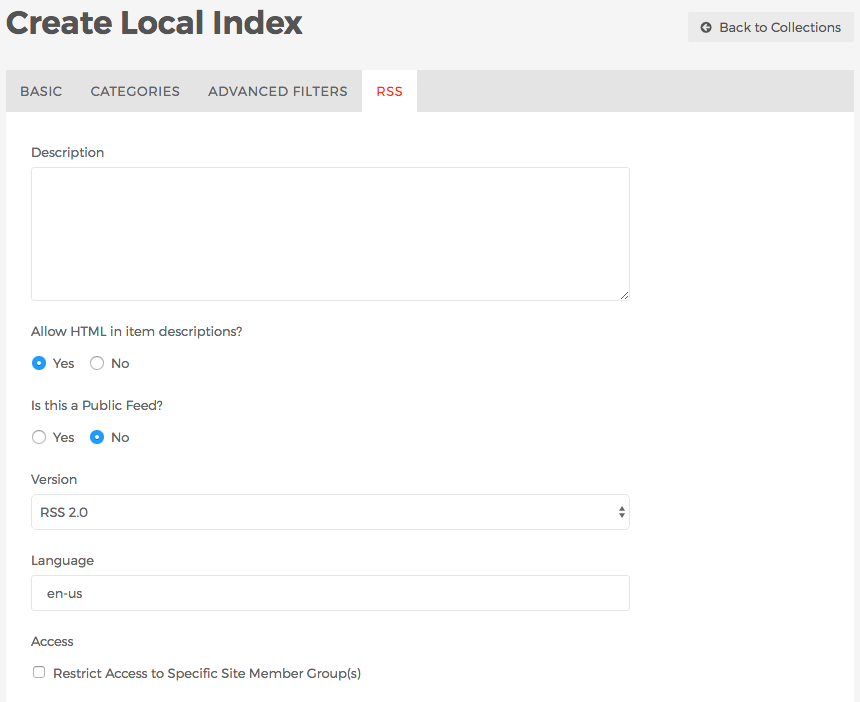
Most information on this tab is used by experienced developers and/or site administrators.

- Description
- Text entered here will be included in the description node of the XML file automatically created by Mura CMS so RSS parsers can display the information to their users.
- Allow HTML in item descriptions?
- If Yes, HTML will be allowed in the item descriptions.
- If No, HTML will not be allowed in the item descriptions, and will be parsed out when being broadcast.
- Is this a Public Feed?
- If Yes, a link to the collection's RSS feed can be included in the layout templates by your developers.
- If No, a public link will not be generated.
- Version
- Select your desired format to broadcast the RSS feed in. Options include RSS 2.0, and RSS 0.920.
- Language
- You may choose to enter a specific language and country code to be included in the RSS feed.
- Access: Restrict Access to Specific Site Member Group(s)?
- If enabled, you can choose which group(s) you wish to allow access.
- Once you have applied all of your desired filters and criteria, click Add to save the new Local Index.
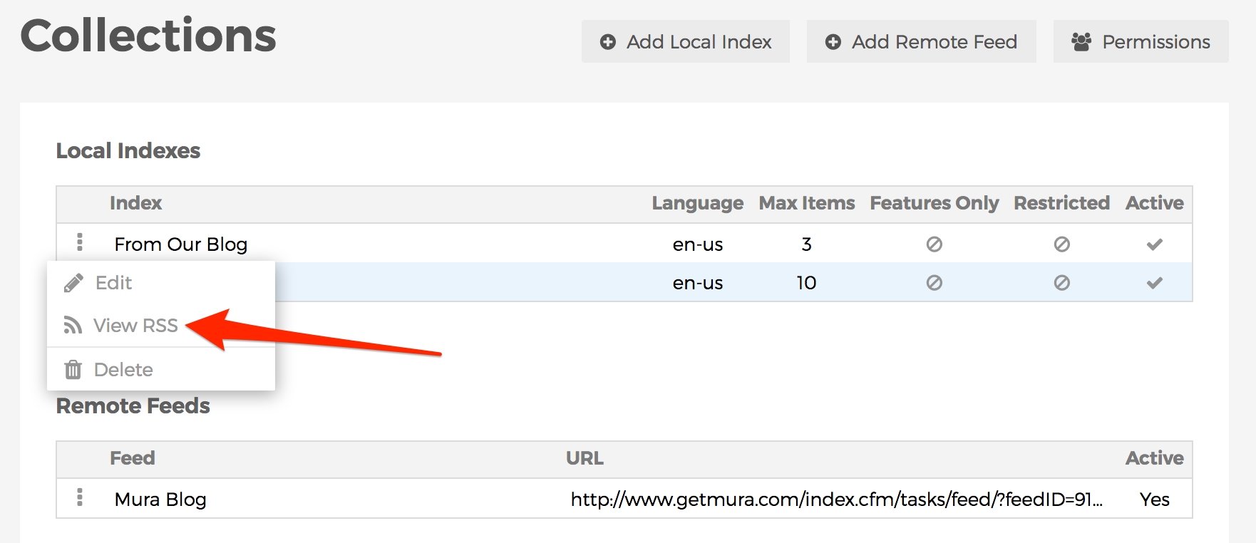
- Your Local Index should appear in the list of available Local Indexes.
- Whenever you create or edit a Local Index, you should click the three-dot menu to the left of your Local Index, and select View RSS and examine the results.

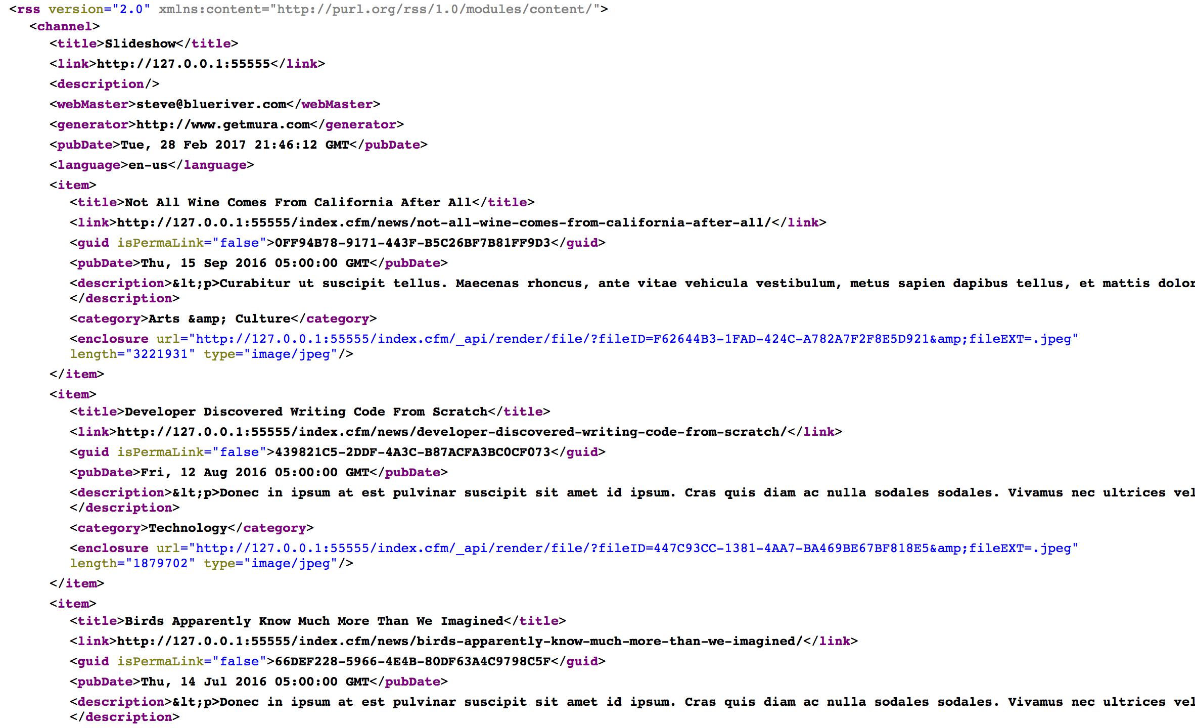
- Depending on your browser's capabilities, you should be able to view either an XML output or nicely formatted output of the Local Index displaying the content items which match your desired filters.

- If you don't see any items listed, it doesn't mean you did anything wrong, it only means there are no content items which match all of the selected filters you've applied when creating/editing your Local Index.
Remote Feeds
A Remote Feed is essentially a collection of content from an external website. This works by using an external website's RSS feed. You can also choose to import the content directly into Mura, and then make modifications to the content items as you wish.
How to Create a Remote Feed
- From the Collections screen, click the Add Remote Feed button.

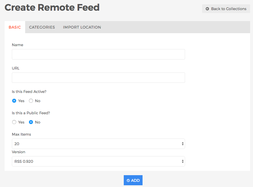
- The Create Remote Feed screen should appear.

- Basic Tab
- Name (required)
- Enter a name for the Collection.
- URL (required)
- Is this Feed Active?
- If Yes, the feed will appear as an option for content managers when creating Collection display objects.
- If No, the feed will not appear as an option for content managers when creating Collection display objects.
- Is this a Public Feed?
- If Yes, a link to the RSS feed can be included in the layout templates by your developers.
- If No, a public link will not be generated.
- Max Items
- Select the default number of items you wish to consume/import.
- Version
- In order to properly consume the content, it's extremely helpful to indicate the external RSS feed's version/format. Options include RSS 0.920, RSS 2.0, and Atom.
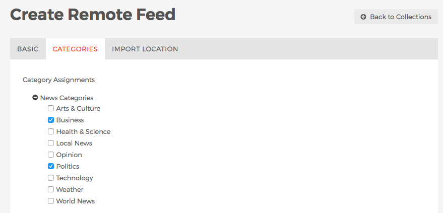
- Categories Tab

- Category Filters
- Select any desired categories you wish content items to match in order to be included in the Collection.
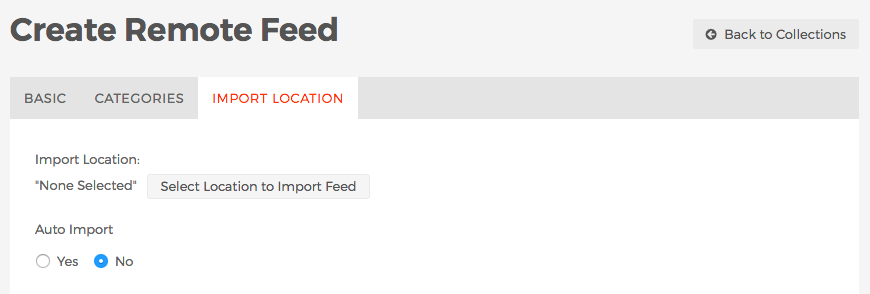
- Import Location Tab

- Import Location
- You may optionally choose to import the external content items into your own website. Select the desired section of the site you wish the content items to be imported to.
- Auto Import
- If Yes, Mura will periodically check the external feed for new content items and import them if found.
- If No, Mura will not import new content items automatically. If you wish to import new content items, you can select the three-dot menu of the Remote Feed, and select "Import" when you wish to do so.

- Click the Add button when finished to save the new Remote Feed.
- Your Remote Feed should appear in the list of available Remote Feeds.
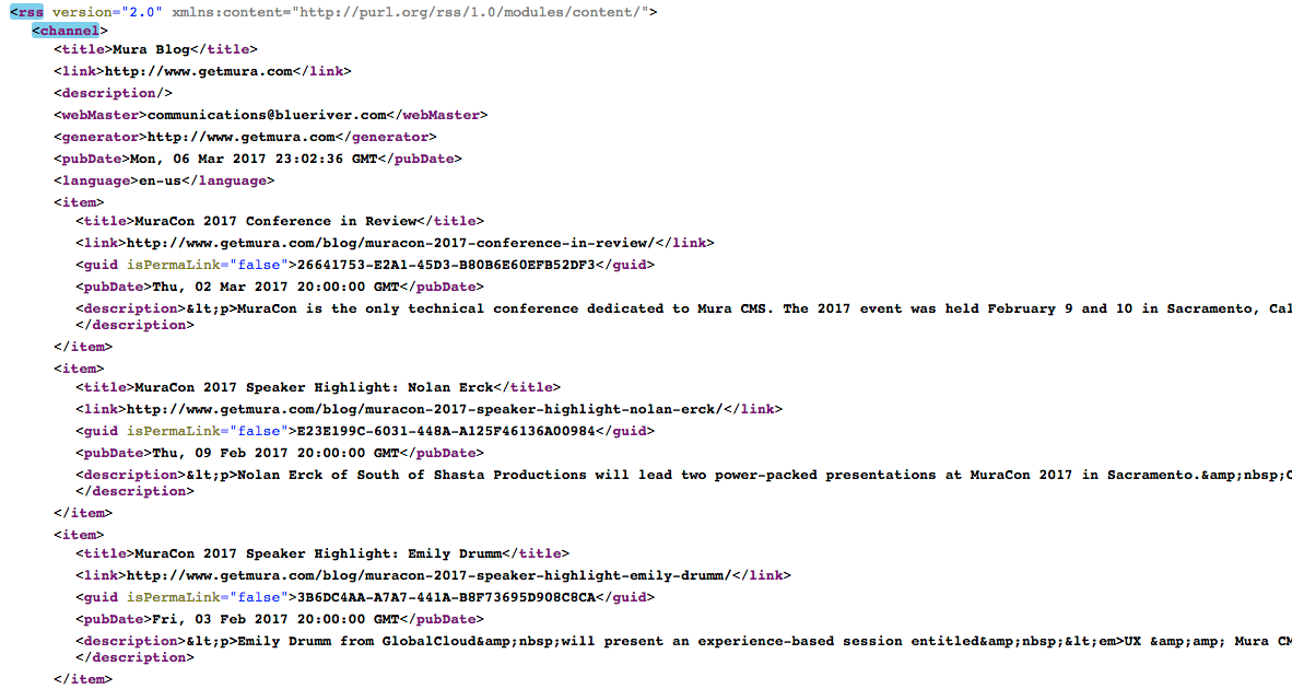
- Whenever you create or edit a Remote Feed, you should click the three-dot menu to the left of your Remote Feed, and select View Feed and examine the results.

- Depending on your browser's capabilities, you should be able to view either an XML output or nicely formatted output of the Remote Feed displaying the content items which match your settings.

- If you don't see any items listed, you may want to verify your settings are entered correctly, and that content items match your desired categories, if selected.
Summary
In this section, we covered many of Mura's advanced features such as the fields of each of the available Tabs when editing content items, Publishing Options, Components, Forms, and Collections. From creating categories, tags, and related content, to creating forms and managing data, you should be well prepared to handle working with the more advanced content features of Mura.


