How to Create/Edit a Form
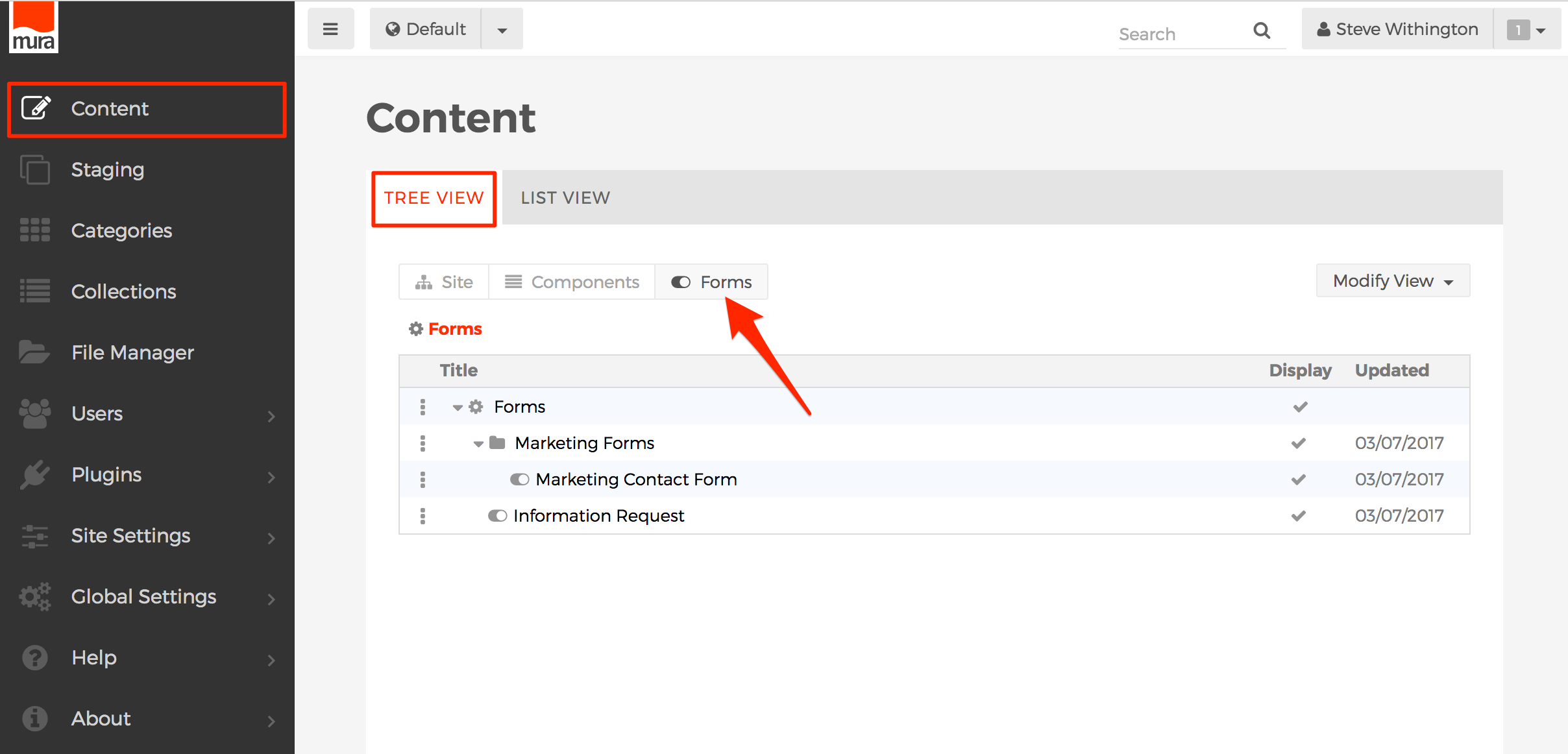
- From the back-end administration area, go to the Content section, select the Tree View tab, then select the Forms button.
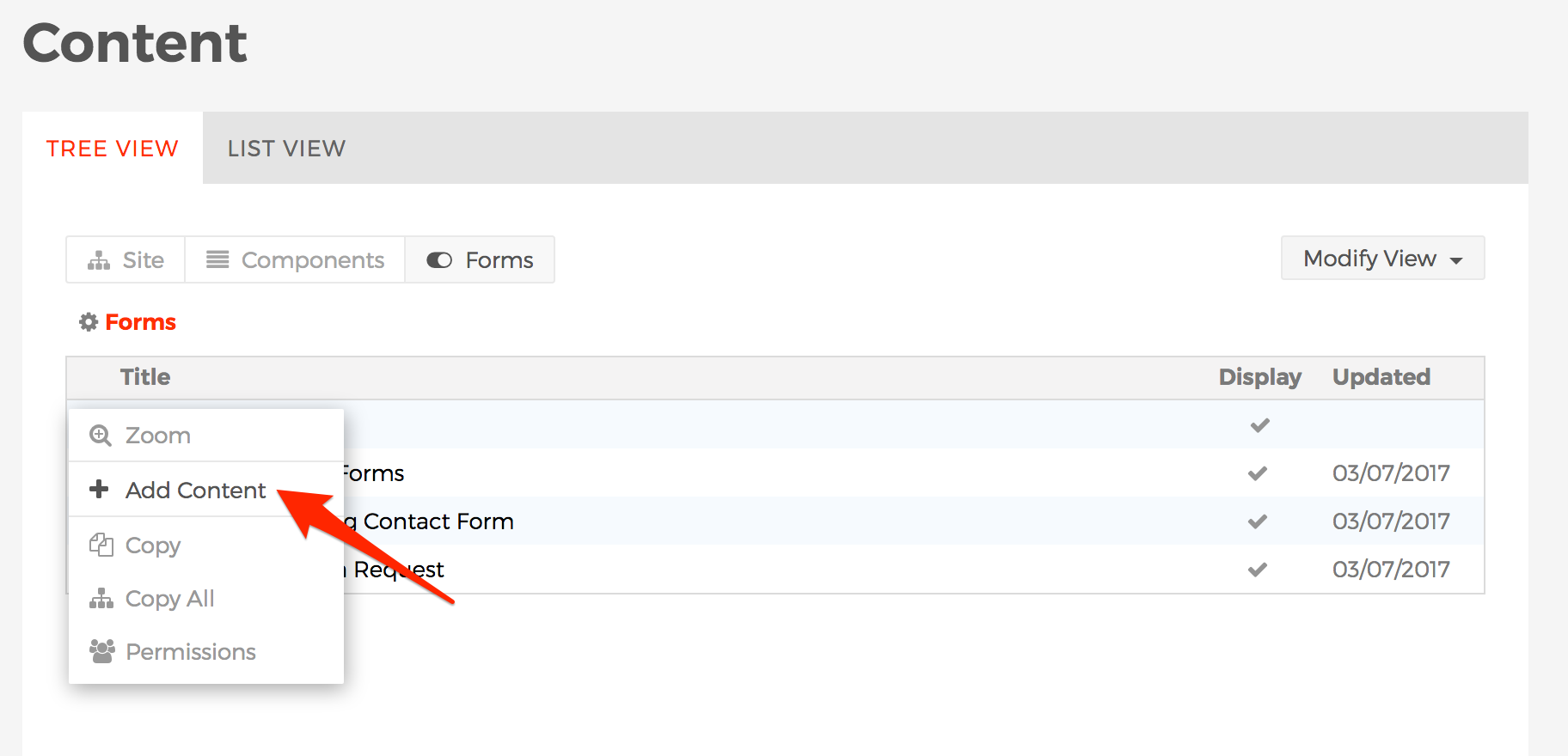
- Click the three-dotted menu beside Forms and select Add Content.
- The Select Content Type dialog window should appear.
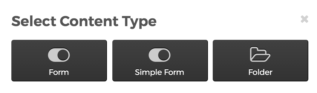
- Form
- The Form option is the most common selection used. Using this option will offer you the ability to create a form using a special user interface, specifically designed with form creation in mind.
- Simple Form
- The Simple Form option is typically used by developers so they have a way to include their own custom designed form, and yet allow the data to be collected and managed by Mura.
- Folder
- The Folder option is available so that you can create groupings of Forms. This is useful for grouping forms logically and also for keeping forms used by similar groups of users together so you only need to set permissions on the Folder, versus having to modify permissions for each and every form.
- Form
- The Create Form screen should appear.
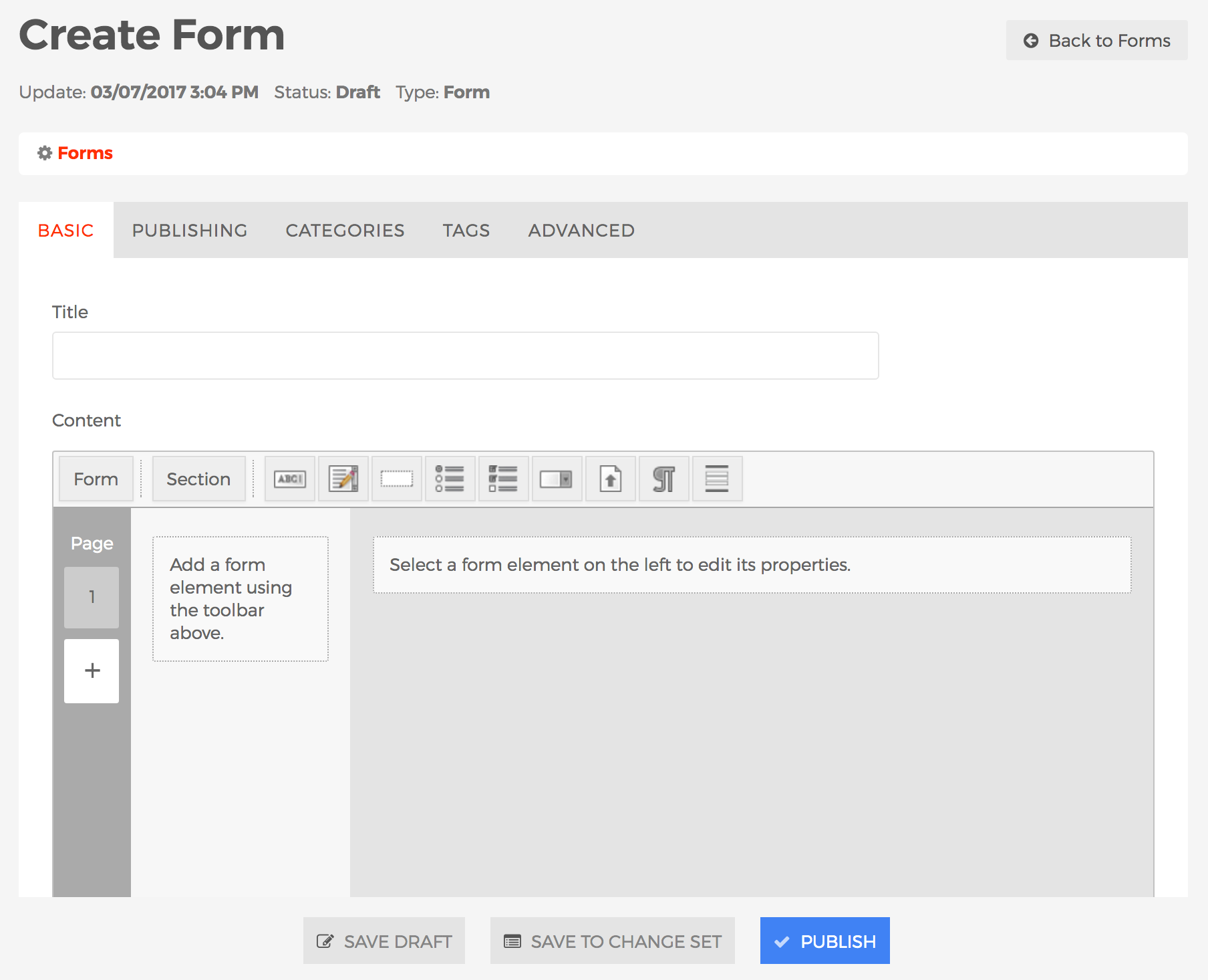
- Basic Tab
- Title (required)
- Enter a title for the form.
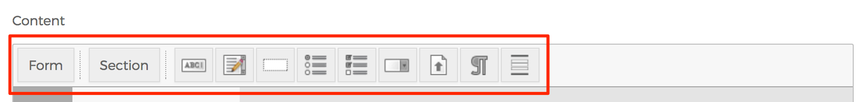
- Content
- Toolbar
- This is where the actual content of the form is created. Across the top of the Content User Interface (UI) is a toolbar which allows you to add/create form elements. To rearrange form elements, simply click, drag, and then drop to your desired order.
- Form Button
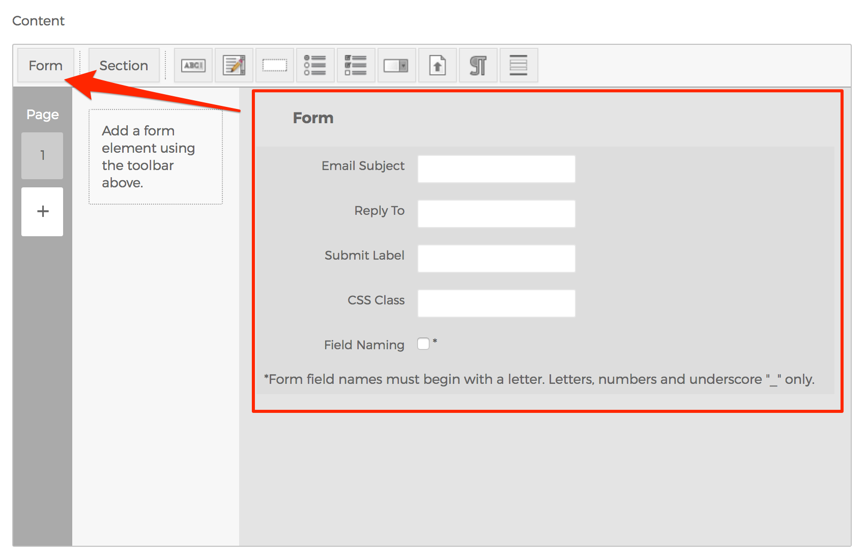
- You may optionally click the "Form" button to enter specific information used when the form data is emailed to any addresses listed under "Send data to email address". You can also change the label of the Submit button, if desired here.
- Section Button
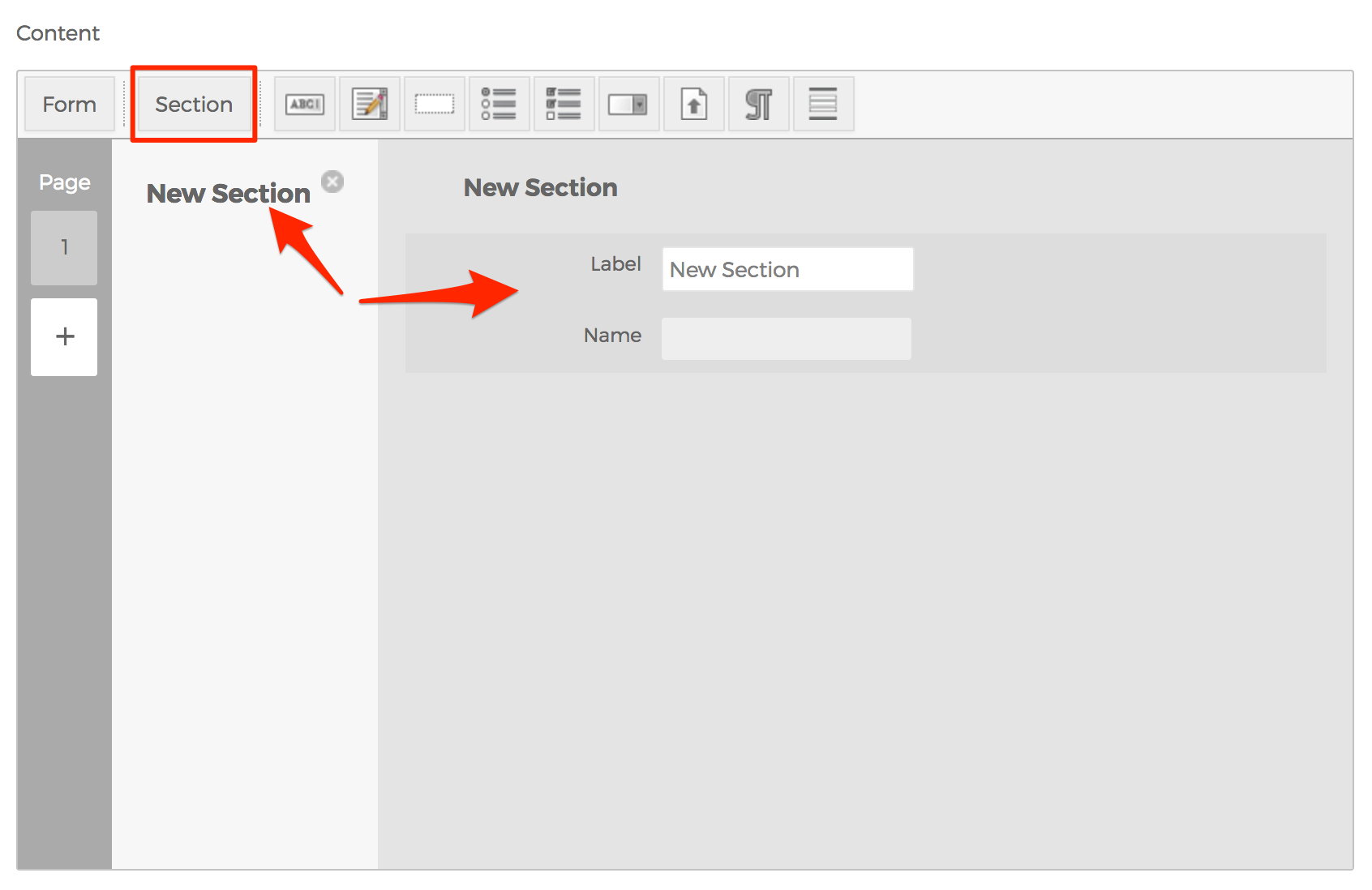
- If you select the "Section" button, it will create a grouping for form fields to belong to. Any fields listed directly below it will appear in that section. For developers, this merely creates a HTML "fieldset" element. Click on the "New Section" element itself to reveal options in the main window.
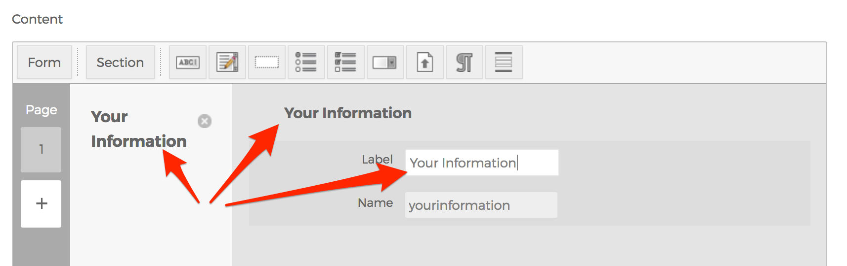
- Any text entered in the Label field will automatically update the information elsewhere. For example, if you enter "Your Information" into the Label field, "Your Information" will also appear at the top of the section, and in the column of form fields.
- Text Field
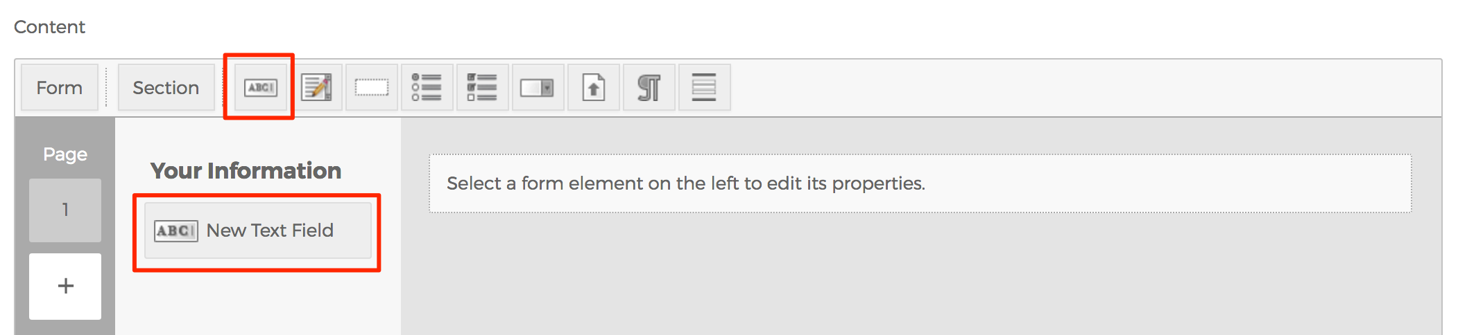
- The Text Field is a commonly used form field used to collect simple data such as names, email addresses, phone numbers, etc.
- Click the "New Text Field" element itself in the left column to reveal options in the main window. Any text you enter in the Label field will automatically update the name and other attributes just as it did in the previous "Section" button. This feature applies to all other form field types as well.
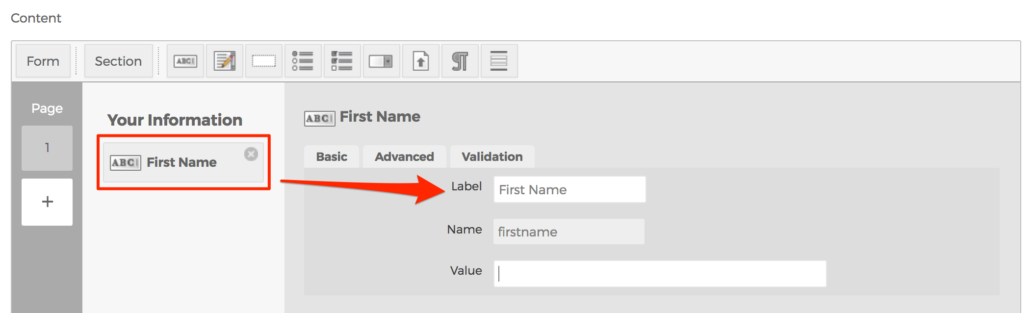
- Basic Tab
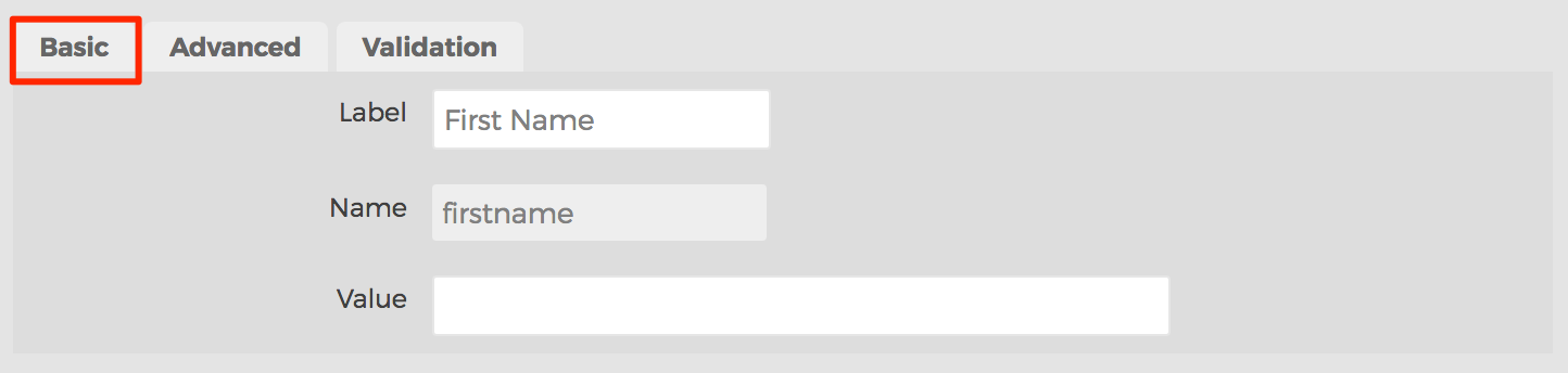
- Label
- Data entered here will appear with the form field so end-users know what to enter into the form field.
- Name
- This field is primarily for developers, and the text here will become the "name" attribute of the form field itself.
- Value
- You may enter a default value to be displayed when the form renders.
- Label
- Advanced Tab
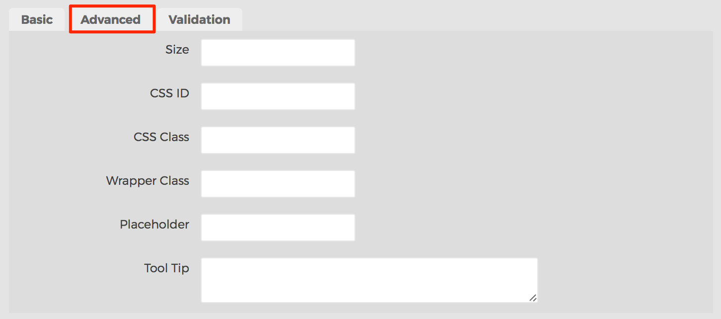
- Size
- Primarily used by developers, data entered here will be used for the form field's "size" attribute.
- CSS ID
- Primarily used by developers, data entered here will be used for the "ID" attribute of the form field.
- CSS Class
- Primarily used by developers, you may enter a CSS class to be applied to the "class" attribute of the form field.
- Wrapper Class
- Primarily used by developers, you may enter a CSS class to be applied to the container in which the form field is placed within.
- Placeholder
- Data entered here will appear inside the form field, but is only "temporary" and will not be used if the form is submitted. For developers, this is the "placeholder" attribute of the form field.
- Tool Tip
- Data entered here will be applied to the "title" attribute of the form field.
- Size
- Validation Tab
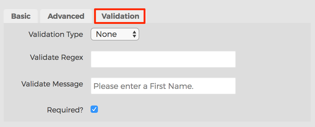
- Validation Type
- None
- No validation will be applied to the form field.
- Numeric
- Validates the data entered in the form field is numeric. If it does not validate, an error message will be displayed.
- Date
- Validates the data entered in the form field is a valid date format. If it does not validate, an error message will be displayed.
- Email
- Validates the data entered in the form field is a valid email address format. It does not verify whether or not the email address actually exists. If it does not validate, an error message will be displayed.
- Regex
- This field is reserved for experienced developers. Enter a JavaScript regular expression that should be invoked when validating the form field here. If it does not validate, an error message will be displayed.
- None
- Validation Regex
- If the Validation Type is set to "Regex", enter a JavaScript regular express to be used here.
- Validate Message
- Text entered here will be displayed to end-users if the form field is required, or does not pass validation rules.
- Required?
- If enabled, the Validate Message will be displayed to end-users who do not complete the form field.
- Validation Type
- Basic Tab
- Text Area
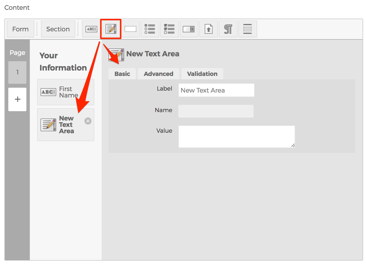
- The Text Area form field represents a multi-line plain-text editing control.
- Hidden Field
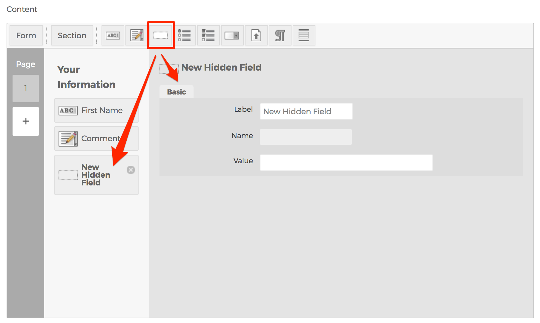
- The Hidden form field does not show on the page. This field is typically used by developers to capture additional, or dynamic data such as the name of the page the form is being used on.
- Radio Button Group
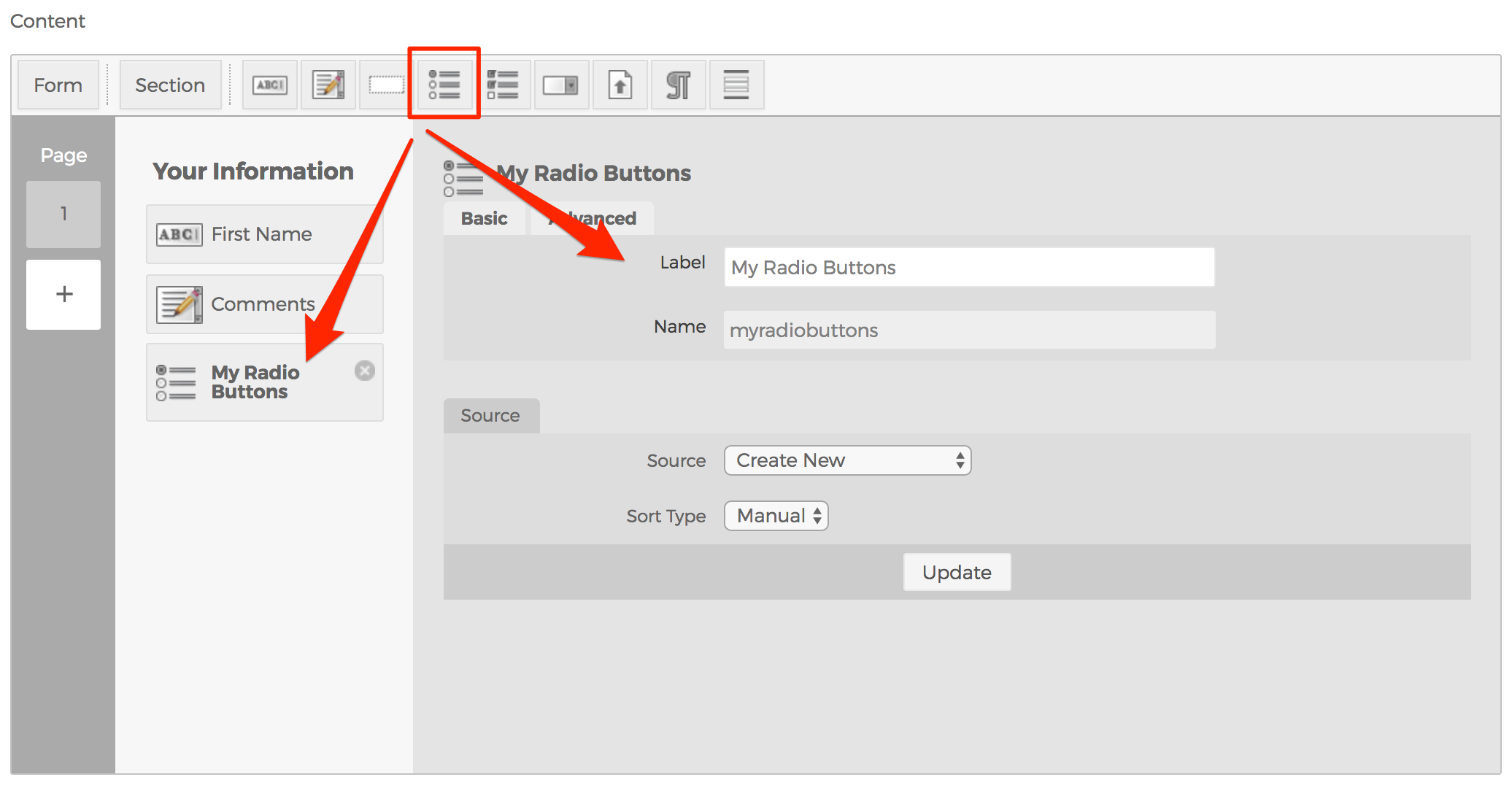
- The Radio Button Group is a listing of many choices, where end-users may only select one.
- Source Tab
- Source Select Menu
- Create New
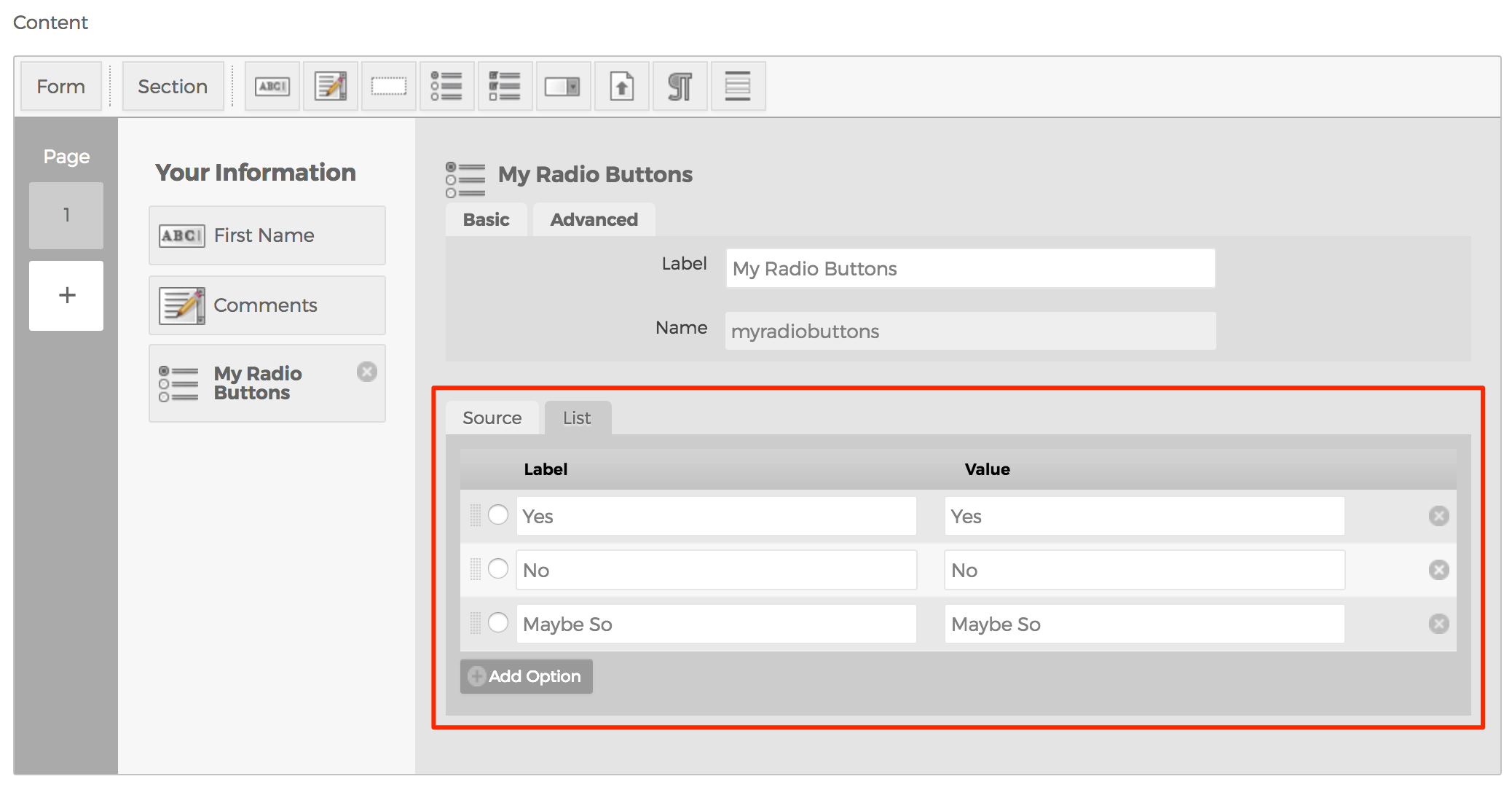
- Selecting Create New, and clicking the "Update" button will create a new List tab.
- For each option, enter a Label to be displayed to the end-user, and a Value to be stored in the database to indicate which option the user selected.
- To indicate a default selection, click the radio button next to your desired default row.
- Custom Display Object
- Primarily used by developers, you may enter the name of a Custom Display Object to use as the source for options.
- Custom Object
- Primarily used by developers, you may enter the name of a Custom Object to use as the source for options.Code example >
- Remote Source
- Primarily used by developers, you may enter a Remote Source to use as the source for options. Code example >
- Create New
- Source Select Menu
- Source Tab
- The Radio Button Group is a listing of many choices, where end-users may only select one.
- Checkboxes
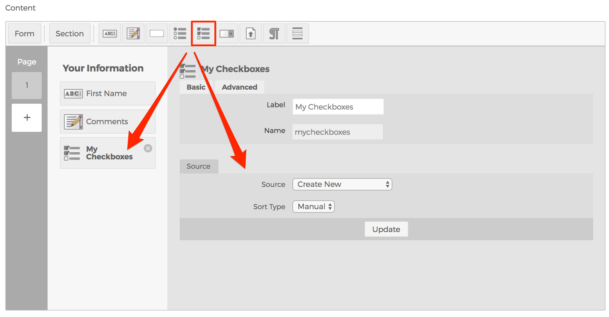
- A Checkbox allows you to select a single value for submission in a form (or not).
- Source Tab
- See the Source Tab section in the Radio Button Groups section above.
- Source Tab
- A Checkbox allows you to select a single value for submission in a form (or not).
- Dropdown Menu
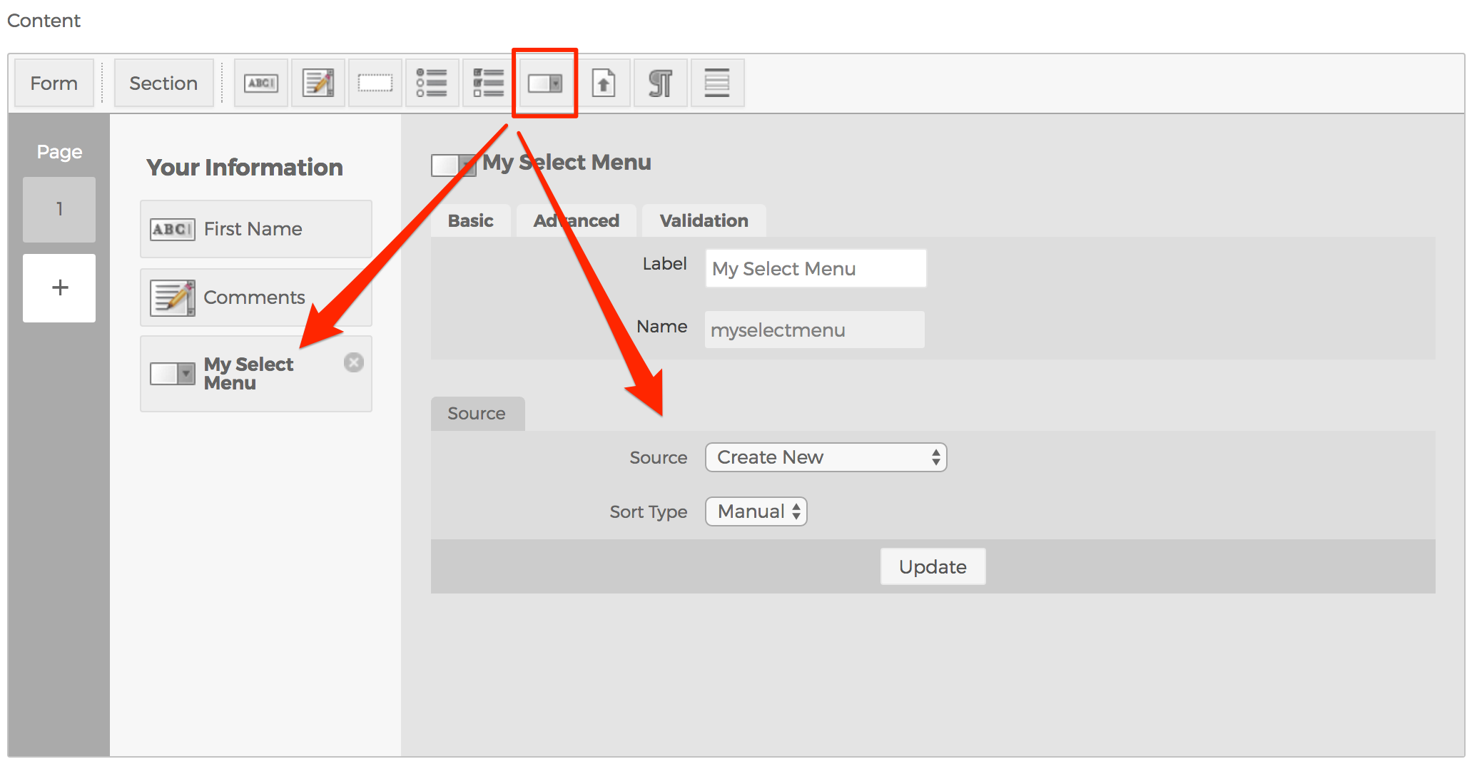
- The Dropdown Menu allows you to create a select menu of options for end-users pick from.
- Source Tab
- See the Source Tab section in the Radio Button Groups section above.
- Source Tab
- The Dropdown Menu allows you to create a select menu of options for end-users pick from.
- File Upload Field
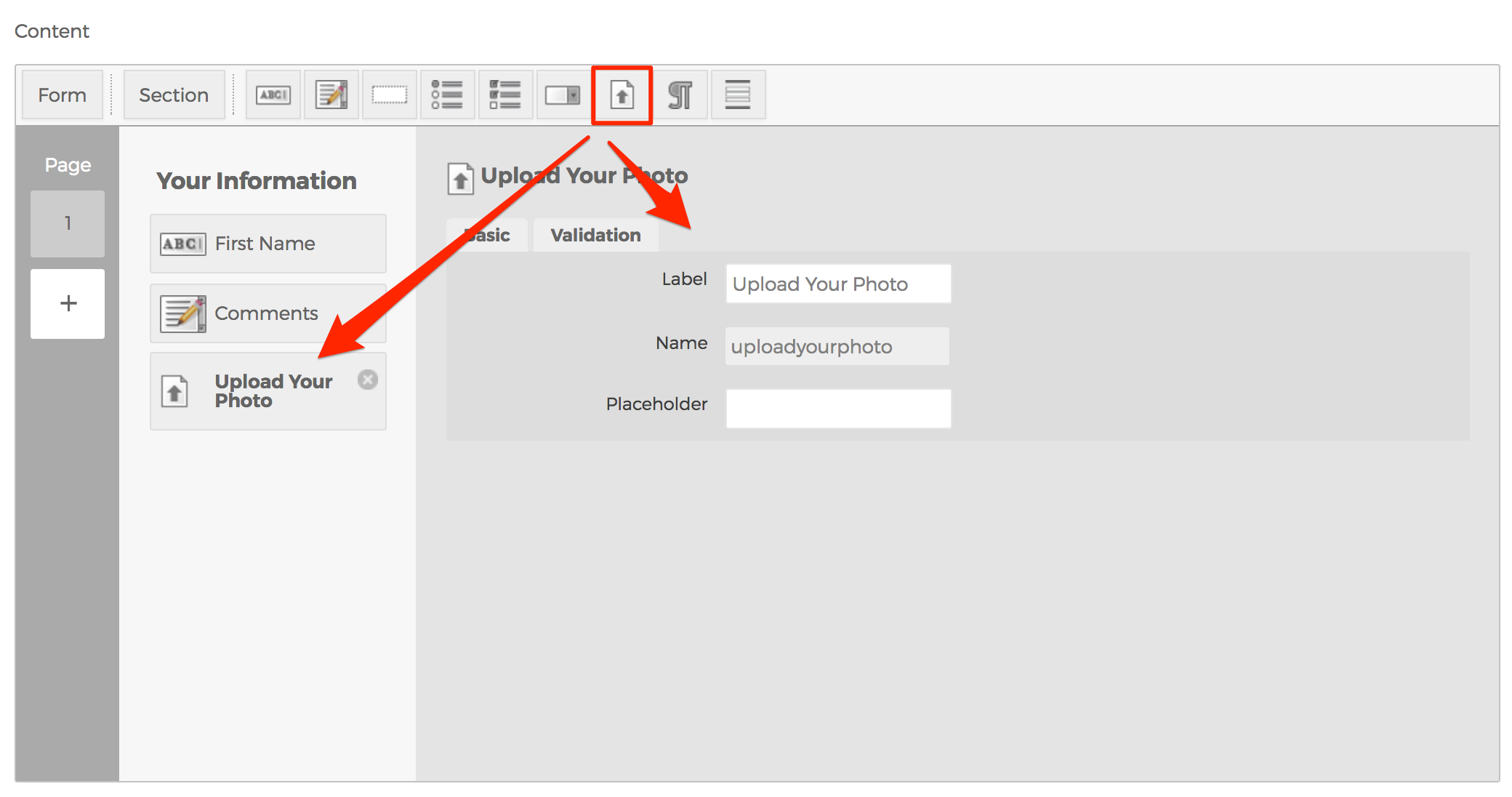
- The File Upload Field creates a form field to enable end-users the ability to attach files to their form submission.
Note: Allowing the general public to upload files to your website may introduce a security risk. Please consult an experienced and qualified developer before using this feature.
- The File Upload Field creates a form field to enable end-users the ability to attach files to their form submission.
- Block of Static Text
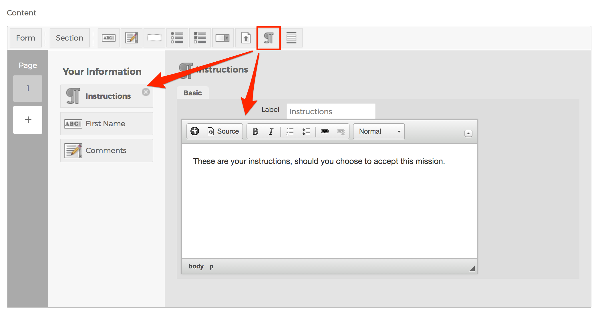
- The Block of Static Text button allows you to add text within the form itself. This is especially useful when you need to add instructions within the form.
- Nested Form
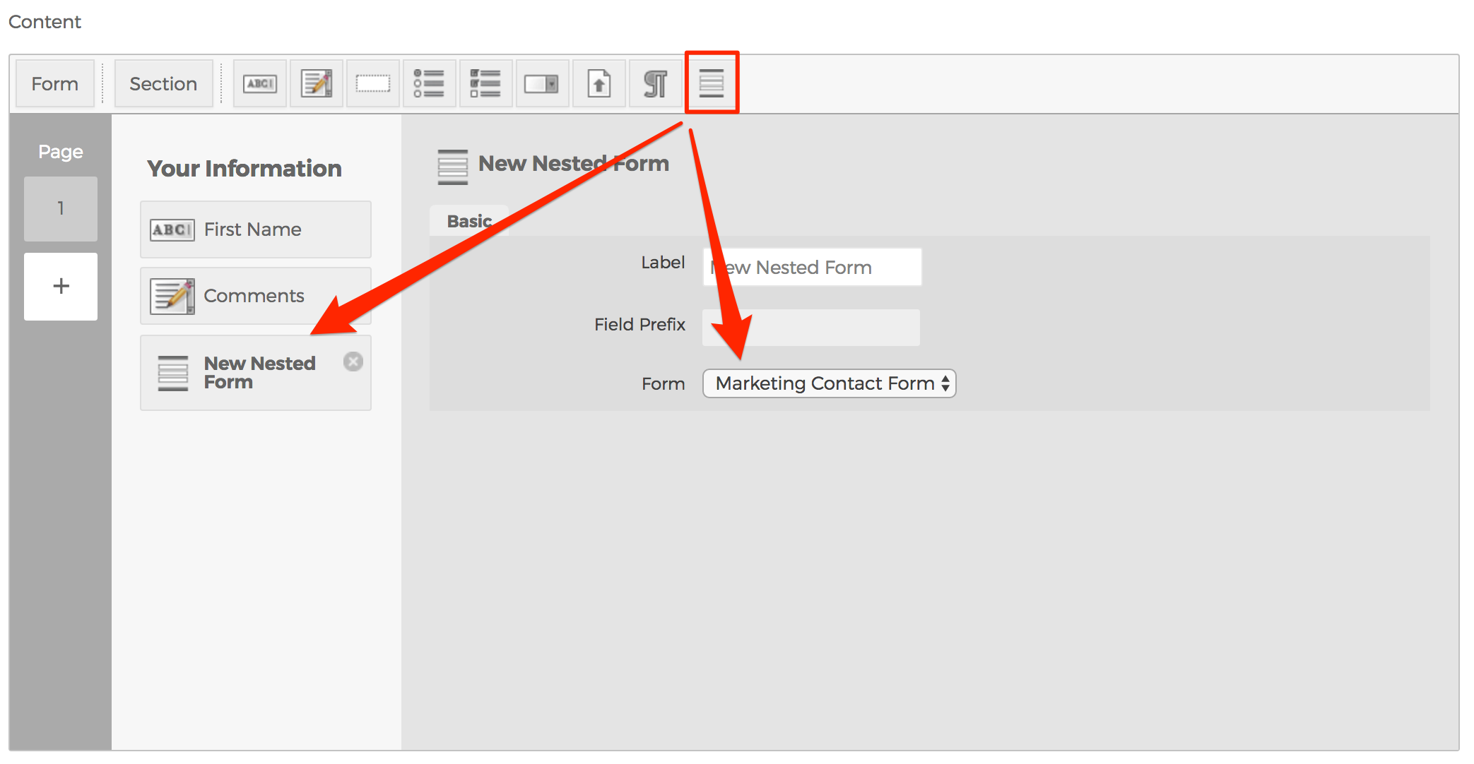
- The Nest Form button enables you to nest another Mura form within the form itself. This is useful when you have multiple forms that may contain duplicate information to be collected such as First Name, Last Name, Email, etc. You could create a separate form with only those fields, and then insert the form into the other forms requiring that data.
- This is where the actual content of the form is created. Across the top of the Content User Interface (UI) is a toolbar which allows you to add/create form elements. To rearrange form elements, simply click, drag, and then drop to your desired order.
- Page
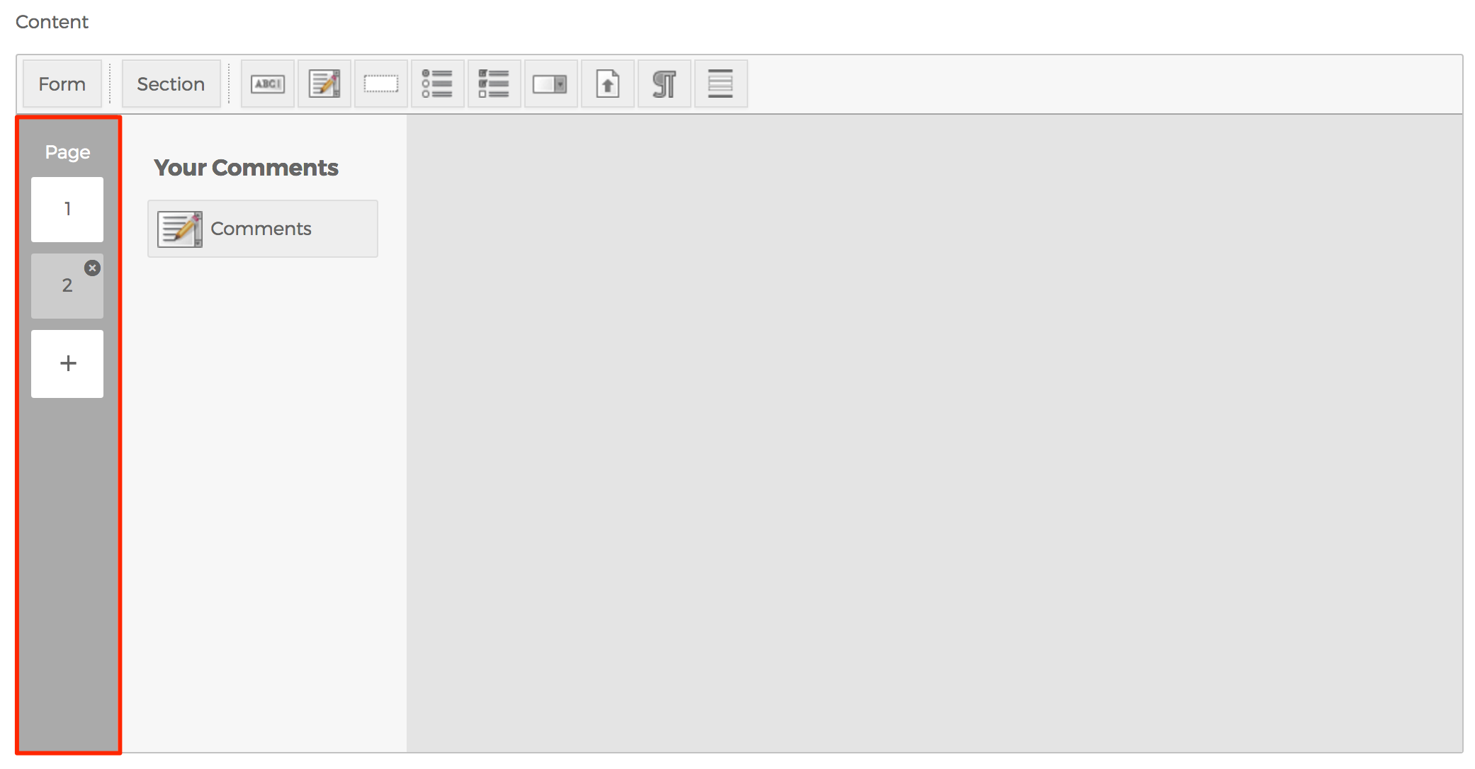
- In the far left column of the Content UI, you can create and/or delete additional "pages" of form fields. This is useful for long forms, and when you wish to display only a subset of form fields to your end-users to reduce the anxiety of completing a long form all at once.
- Click the Plus sign to add a new page.
- To delete a page, select the page you wish to delete, then click the circle with an "x" in the middle of it to remove the page.
- Toolbar
- Confirmation Message
- Text entered here will appear for users after they successfully complete and submit the form. This is a great place to add information such as your organization's phone number, business hours, etc.
- Send data to email address (Separate multiple email addresses by comma)
- Enter a comma-delimited list of email addresses of where you would like email notifications sent to. Many organizations use a group email address of some kind for this field such as sales@yourdomain.com instead of entering individual's email addresses here.
- Title (required)
- Publishing Tab
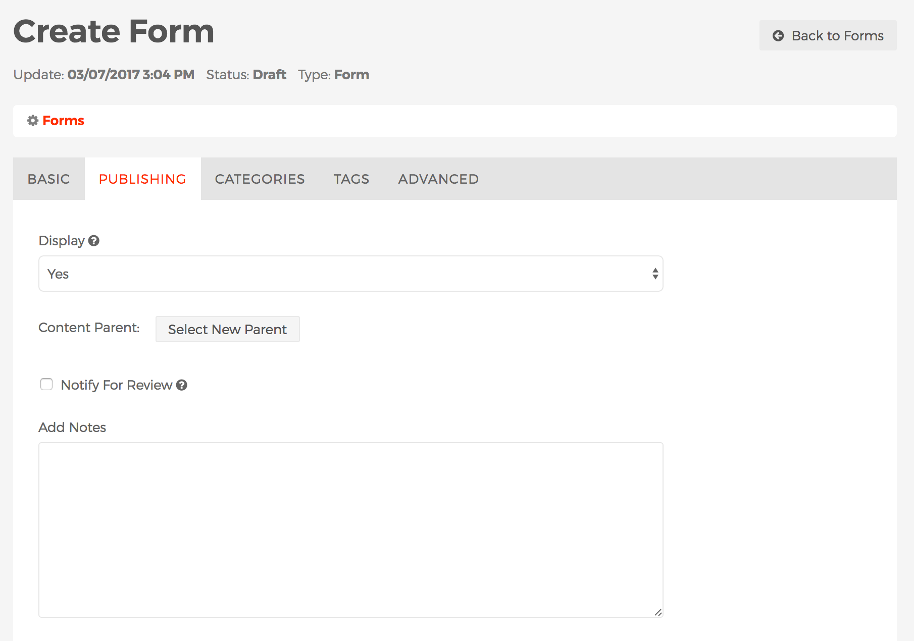
- Display
-
This field controls whether or not the form will be visible to users via the public, front-end view of your site.
-
Yes
-
If Yes, then the form will be visible to users via the public, front-end view of your site.
-
-
No
-
If No, the form will not be visible to users via the public, front-end view of your site.
-
-
Per Schedule
-
You may specify a schedule for the form to display, including the frequency of the display such as daily, weekly, monthly, etc. and when the form should stop displaying, if ever.
-
-
-
Content Parent
-
You may use this field to move a form to be grouped under another form or Folder of forms. See the Selecting New Parent section for more details and instructions.
-
-
Notify For Review
- When enabled, Send to and Message fields will appear.
- Send to
- You may select one or more users to receive an email notification after saving or publishing the form. To select more than one person, use <CTRL> + click (on a PC) or <CMD> + click (on a Mac).
- Message
- Text entered here will accompany a link to view the form in the email notification.
-
Add Notes
-
This field allows you to enter informational notes which can be shared amongst content managers, without it appearing anywhere on the public, front-end view of the site.
-
- Display
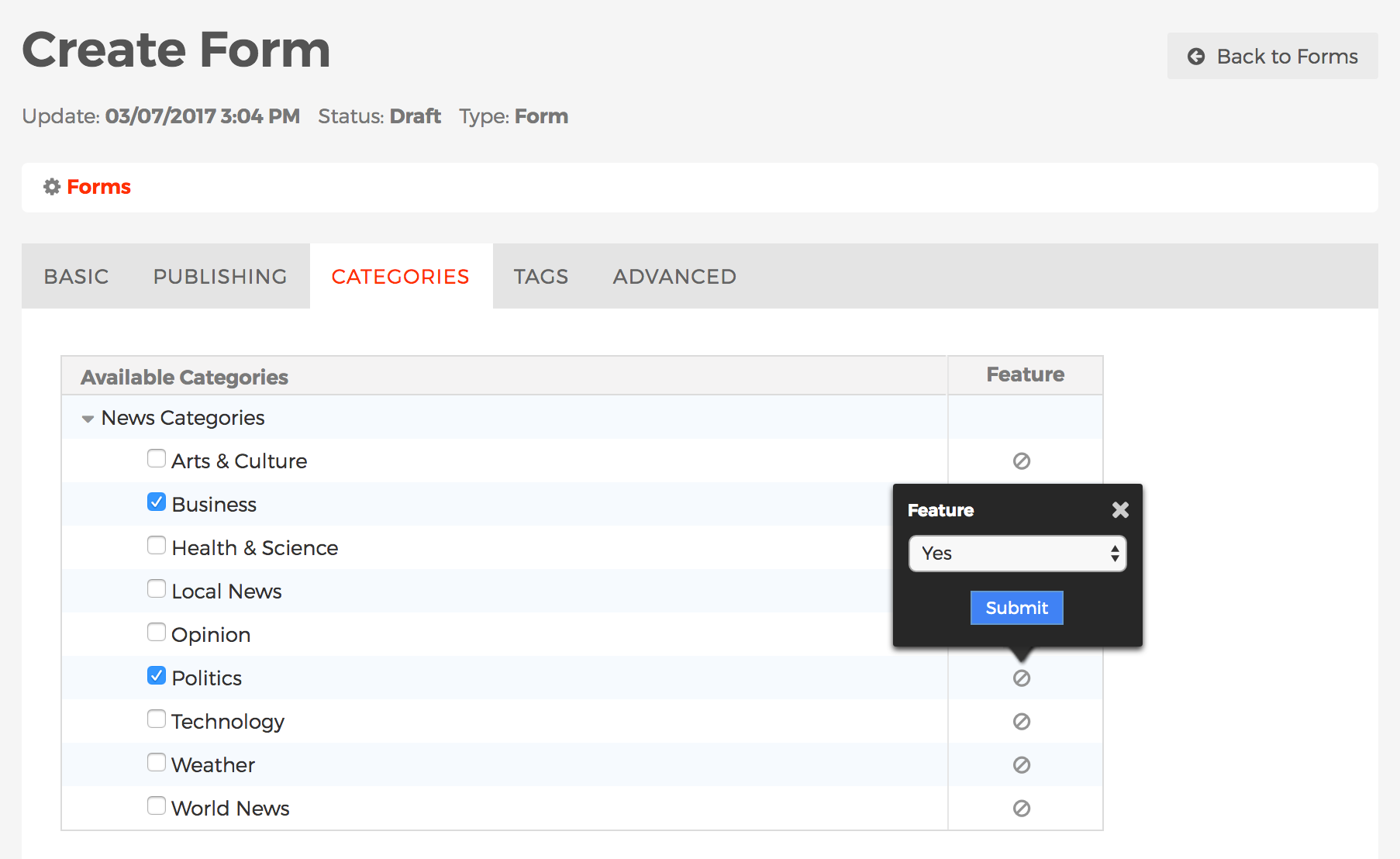
- Categories Tab
-
The Categories tab is where you manage a form's Categories. To learn more about Categories, including how to create/manage categories, and categorize content, visit the Categories section.
-
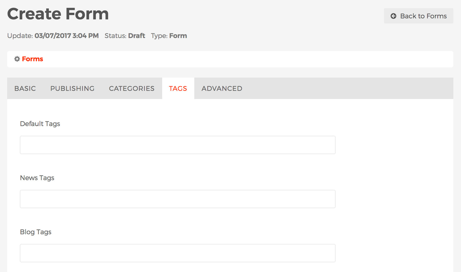
- Tags Tab
-
The Tags tab is where you manage a forms's Tags. Visit the Tags section to learn more about Mura Tags.
-
- Advanced Tab
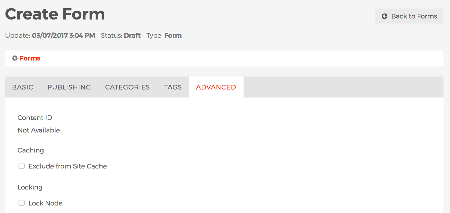
- Content ID
- This is a unique identifier of the form and typically used by developers.
- Caching
- Mura uses "caching" to store data in memory, so future requests for that data can be served faster.
- Exclude from Site Cache
- If enabled, Mura will not include the form in Mura's data cache.
- Locking
- Mura offers the ability to "lock" forms so they will not be accidentally deleted by content managers.
- Lock Node
- If enabled, content managers will not be able to delete the form.
- Content ID
- Basic Tab
- After completing the form, select your desired publishing option to save your form.
- To add the form to a page or section of your site, please visit the Form Display Object Type section.