Using a Mobile-Specific Layout
As an alternative to using responsive layouts, you can use a mobile-specific layout template. Even though responsive front-end frameworks are the most popular today, there are still a number of popular mobile-specific frameworks in use such as jQuery Mobile, Framework 7, and Ratchet. You are free to use any framework you wish with Mura.
mobileFormat Cookie
Mura automatically detects the type of device being used to access a site by checking the User-Agent string. If Mura discovers a user is accessing the site from a mobile device, it sets a cookie labeled "mobileFormat" to true, otherwise it's set to false. In addition, when mobileFormat=true, Mura will automatically scan your theme's templates directory for a file labeled mobile.cfm to use as the layout template.
The mobileFormat cookie/setting can also be set via the URL. For example, if you append ?mobileFormat=true to your URL, you are effectively setting the cookie's value to true. Conversely, appending ?mobileFormat=false to the URL sets the cookie's value to false. This is useful for when you may wish to include a link for users to toggle between your "mobile" version and "desktop" or "full" version of your site.
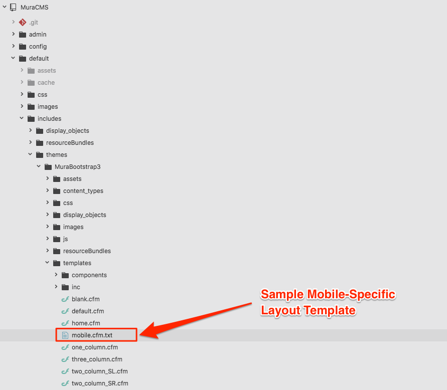
mobile.cfm Layout Template
As previously mentioned, if a user is accessing your site from a mobile device, Mura will look for a special layout template located under {context}/{SiteID}/includes/themes/{ThemeName}/templates/mobile.cfm. If this file is found, it will be used as the layout template for as long as mobileFormat=true.
Mura's default theme, MuraBootstrap3, includes an example mobile-specific layout template. However, it's initially appended with ".txt" so that Mura will not automatically apply the layout template, since the included theme is already built with responsive layouts.
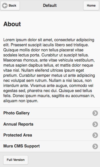
If you were to rename the mobile.cfm.txt layout template to mobile.cfm, and add ?mobileFormat=true to your URL, you should see that Mura is now using the mobile-specific layout template.
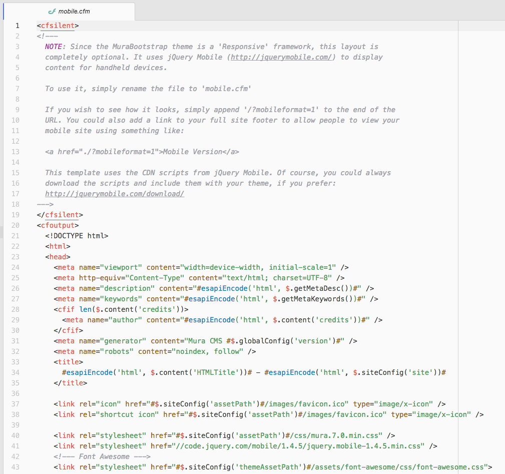
If we open the mobile.cfm layout template file, you'll see that it's merely using the jQuery Mobile framework.
You can apply the lessons learned from the Theme Layout Templates section to using the mobile.cfm layout template as well. Then, you'll spend most of your time swapping your static markup with Mura's template variables and helper methods.