Using Responsive Layouts
The use of responsive web designs has grown exponentially, along with the explosion of people using their mobile devices to surf the web. Responsive design is a development approach where the page layout dynamically adjusts to the size of a user's screen, and often includes checking which type of device or browser is being used to access the site. Hence, content displayed on a "desktop" browser in a three-column layout, may re-flow to a two-column format for tablet devices, and a one-column layout for smaller, mobile devices.
Most modern front-end frameworks such as Bootstrap, Foundation, Semantic UI, and others, accommodate responsive layouts. Mura's default theme, MuraBootstrap3, utilizes the responsive web design features of Bootstrap.
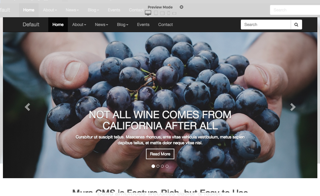
As you'll see in the "What Can I Use?" section, you can use pretty much any front-end framework you want. Mura also includes a useful tool when previewing the front-end of your site. The front-end toolbar includes a "Multi-Device Preview" button.

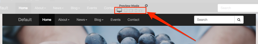
Clicking the Multi-Device Preview button will launch the Preview Mode window.
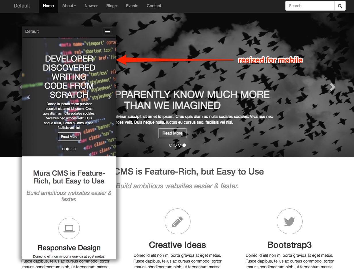
At the top of the window, you should be able to see five different button icons, each representing a different "view". Selecting a different icon, the screen will resize to give you an idea of how your content might display on a device with similar viewport dimensions. Options cover Desktop, Tablet Portrait, Tablet Landscape, Phone Portrait, and Phone Landscape.
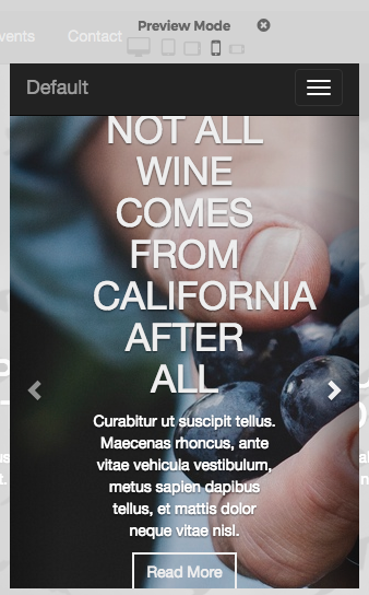
For example, selecting Phone Portrait, the home page of the MuraBootstrap3 site might look like the following illustration.
Responsive layouts may be one approach you can use in Mura to deliver mostly the same content and features to your site visitors.