Collection
Collections are essentially indexes of content based on pre-defined search criteria or filters. (Visit the Collections section to learn how to create and manage Mura Collections.) The "Collection" display object enables you to quickly and easily place these "indexes of content" throughout your site and layouts so visitors to your site may find additional information they may find interesting or useful to them.
Follow the steps below to apply a Collection to a page or section of your site.
- From the front-end public view of your site, hover over the pencil icon on the front-end toolbar and select Inline Edit.
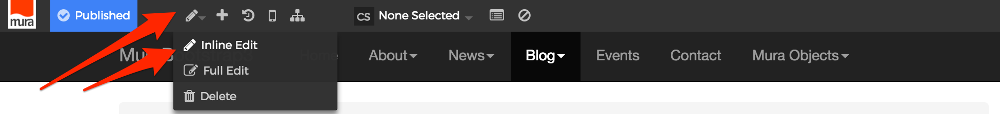
- The inline edit panel should appear on the right-hand portion of your browser.
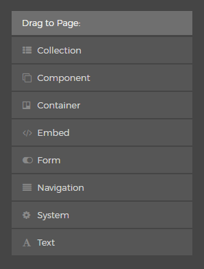
- Select the Collection display object, and then drag it to your desired area, such as above the main content region. As you drag the display object, drop zone target areas will highlight with either a red dotted box or red dotted line.
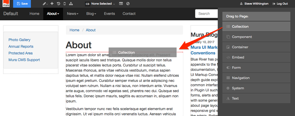
- When you release the mouse button, the display object should appear on your screen, and the inline edit panel should display a form with configuration options. Additional options may appear depending on the selections made to various form elements.
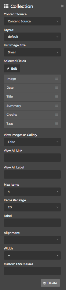
- Content Source
You will need to select a "Content Source" from one of the options listed below:- Local Index
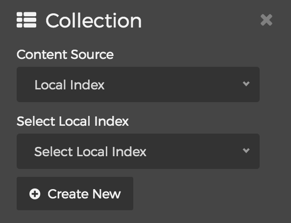
- Selecting the "Local Index" option will reveal the "Select Local Index" menu. Simply select your desired Local Index from the list, or click the "Create New" button to create a brand new Local Index
- Remote Feed
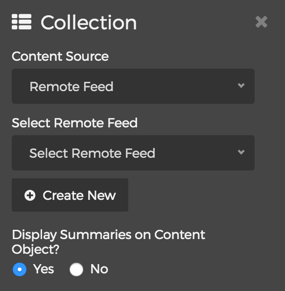
- Selecting the "Remote Feed" option will reveal the "Select Remote Feed" menu. Simply select your desired Remote Feed, or click the "Create New" button to create a brand new Remote Feed.
- You can also choose whether or not you wish to "Display Summaries on Content Object?"
- Related Content
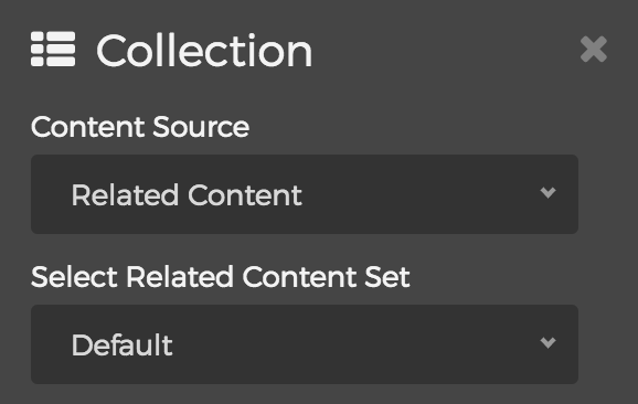
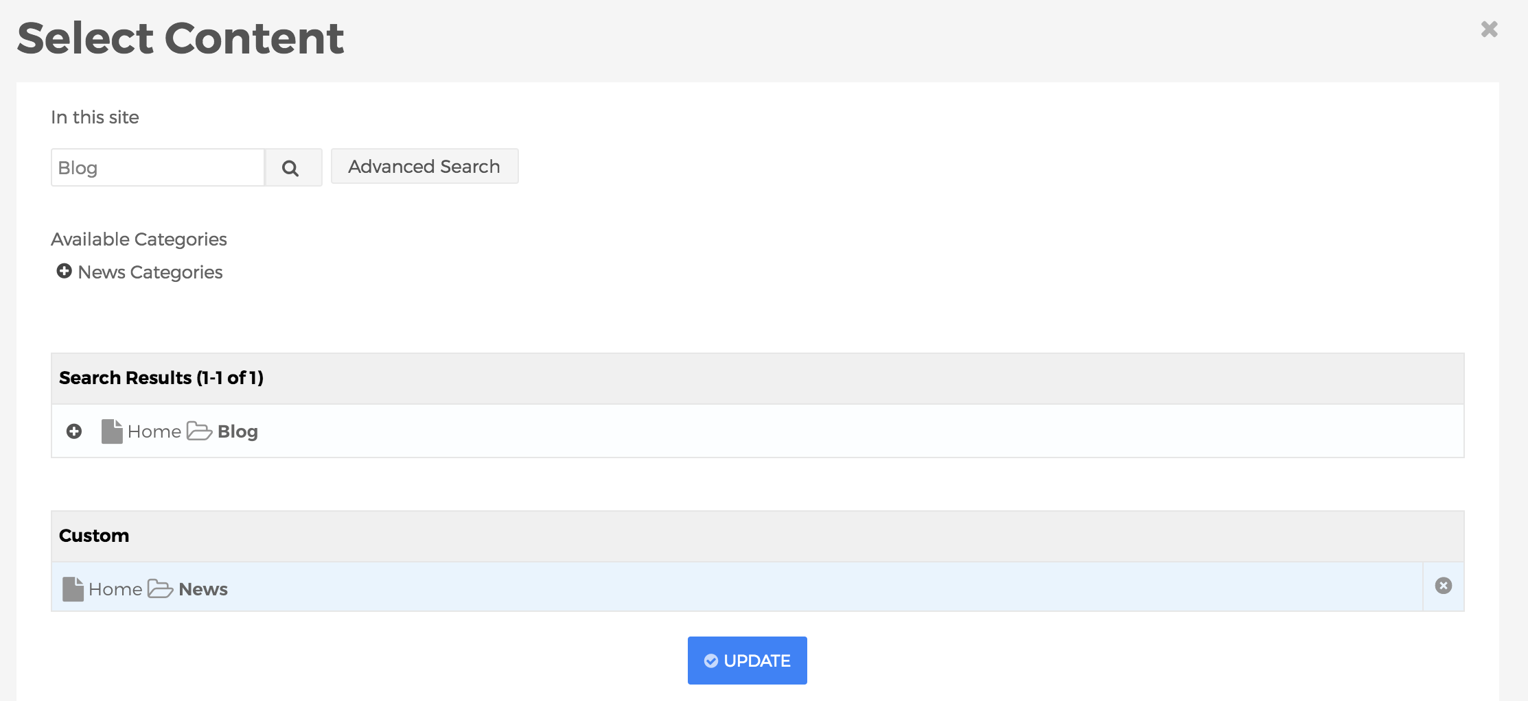
- Selecting the "Related Content" option will reveal the "Select Related Content Set" menu. You can choose any defined Related Content Sets, or select "Custom" and then click the "Edit" button to build a custom Related Content Set specifically for this display.
- Selecting the "Related Content" option will reveal the "Select Related Content Set" menu. You can choose any defined Related Content Sets, or select "Custom" and then click the "Edit" button to build a custom Related Content Set specifically for this display.
- Local Index
- Layout
The layouts listed below are merely the predefined options which ship with Mura CMS. Your options may vary if a developer has created additional options for your specific site.- Default
See "List" below - Custom
Displays content items based on a "custom" layout option created by a developer. This is just an example layout that ships with Mura CMS for developers to use as a starting point.
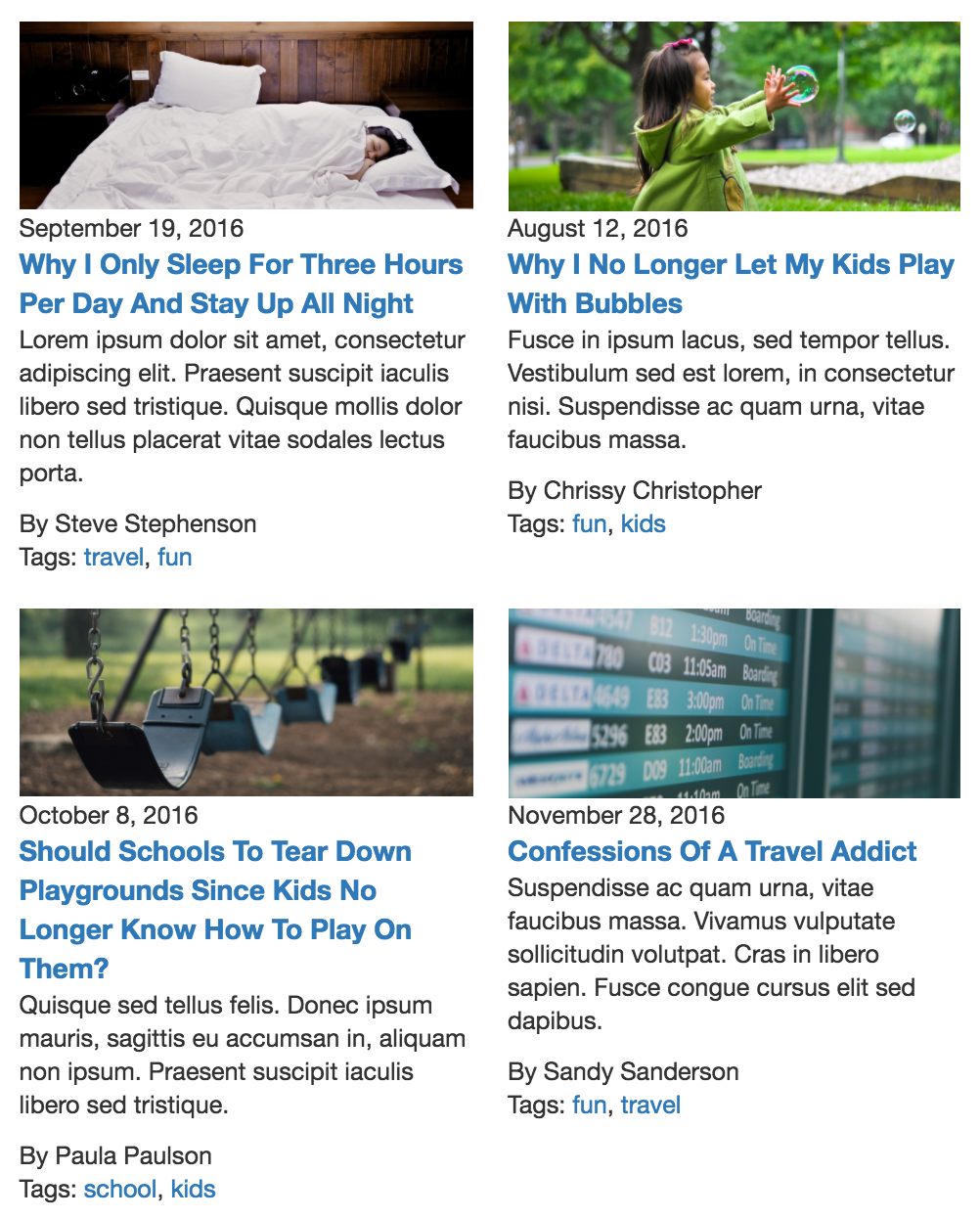
- Grid
Displays content items as a "grid." You can also select the "Grid Style" by choosing anywhere from 1 Column through 9 Column options.
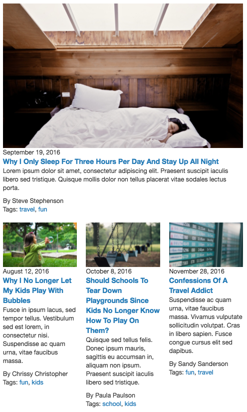
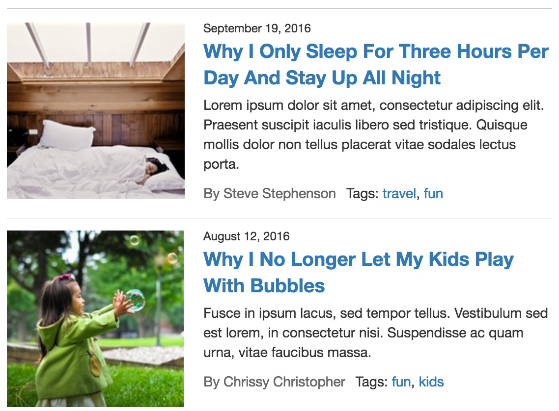
- List
Displays content items as a "list"
- Default
- List Image Size
- You can select from the available options of small, medium, large, custom, or any other pre-defined image sizes to control the size of the image to be displayed in the listing of content, assuming "Image" is selected as one of the fields to display.
- Selected Fields
- This section of the form controls which elements of the content item will display in the listing. Click the "Edit" button to launch the "Select Fields" dialog window.
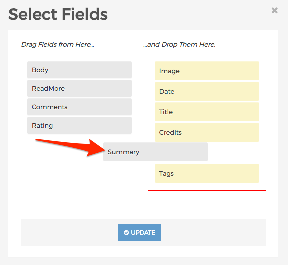
- Here, you can add and/or remove and rearrange fields you wish (or don't wish) to display in the listing. When finished making your selections. Click Update to save your options. The selected fields will now appear on the form. Click and drag any of the fields in the list to reorder them as you wish.
- As you release the mouse click, the display object will dynamically update to reflect your changes.
- This section of the form controls which elements of the content item will display in the listing. Click the "Edit" button to launch the "Select Fields" dialog window.
- View Images as Gallery
Options are True and False:- True: When a user clicks an image, a "Large" version of the image will open in a modal window.
- False: When a user clicks an image, it will be treated like a regular link and the user will be taken to the content item's URL.
- View All Link
- You can enter a custom URL for a user to be directed to when they click the "View All" link
- View All Label
- If you don't like the standard "View All" label for the "View All" link, you can enter your own here.
- Max Items
- This controls the maximum number of items to display.
- Items Per Page
- This controls the number of items to display before pagination kicks in.
- Label
Enter the name for the new container. - Alignment
You may select an "Alignment" from one of the options listed below:- Left
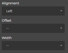
- Selecting the "Left" option will reveal the "Offset" and "Width" menus. Simply select your desired Offset and Width.
- Right
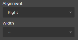
- Selecting the "Right" option will reveal the "Width" menu. Simply select your desired Width.
- Left
- Custom CSS Classes
Enter the name of the custom CSS class.
- Select the Delete button to remove the Collection from the layout.
- Content Source
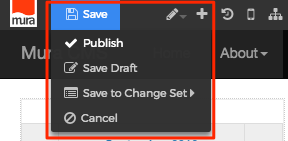
- When you're done making edits, select your desired publishing option to save your changes.