Component
Components are reusable content objects that can be shared across multiple pages or sections within your site. To learn more about Components, visit the Components section.
Follow the steps below to apply a Component as a display object to a page or section of your site.
- From the front-end public view of your site, hover over the pencil icon on the front-end toolbar and select Inline Edit.
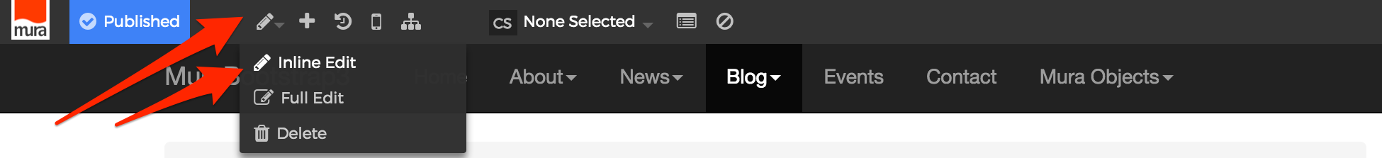
- The inline edit panel should appear on the right-hand portion of your browser.
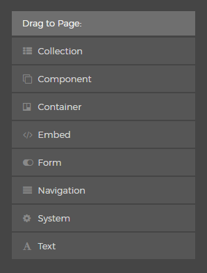
- Select the Component display object, and then drag it to your desired area, such as the right-hand column. As you drag the display object, drop zone target areas will highlight with either a red dotted box or red dotted line.
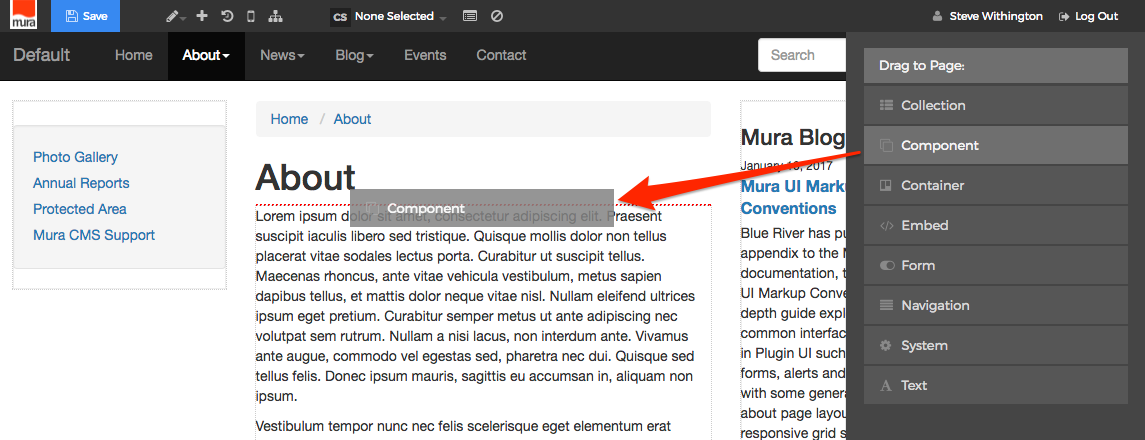
- When you release the mouse button, the display object should appear on your screen, and the inline edit panel should display a form with configuration options.
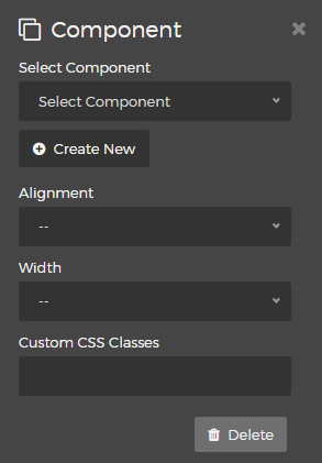
- Select Component
You will need to select a "Component" from the options listed below:
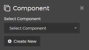
Simply select your desired Component from the list, or click the "Create New" button to create a brand new Component. - Alignment
You may select an "Alignment" from one of the options listed below:- Left
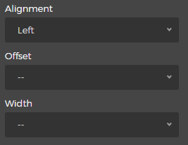
- Selecting the "Left" option will reveal the "Offset" and "Width" menus. Simply select your desired Offset and Width.
- Right
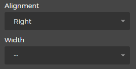
- Selecting the "Right" option will reveal the "Width" menu. Simply select your desired Width.
- Left
- Custom CSS Classes
Enter the name of the custom CSS class.
- Select Component
- Select the Delete button if you wish to remove the Component from the layout.
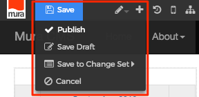
- When you're done making edits, select your desired publishing option to save your changes.